-
-
Fig.1 - Vinyl sleeve
-
Fig.2 - Vinyl back
-
Fig.4 - Vinyl sleeve
-
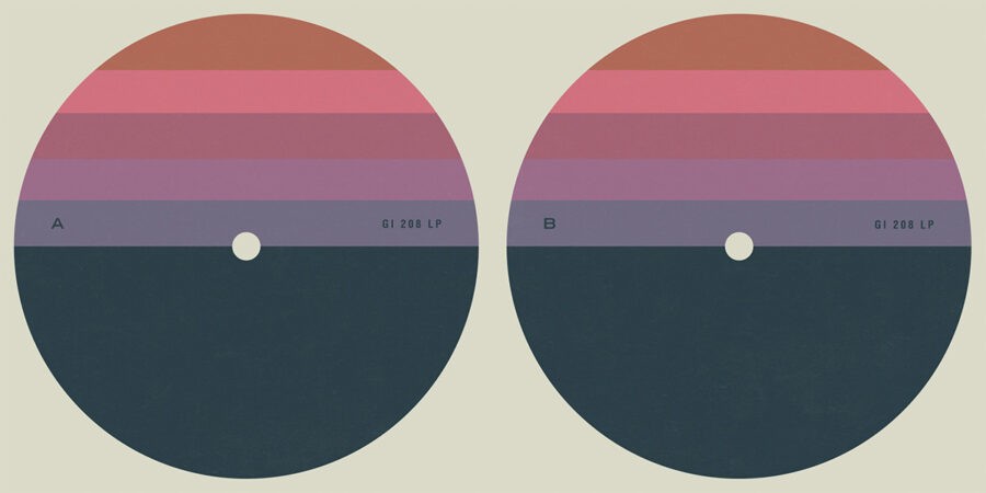
Fig.3 - Vinyl labels
-
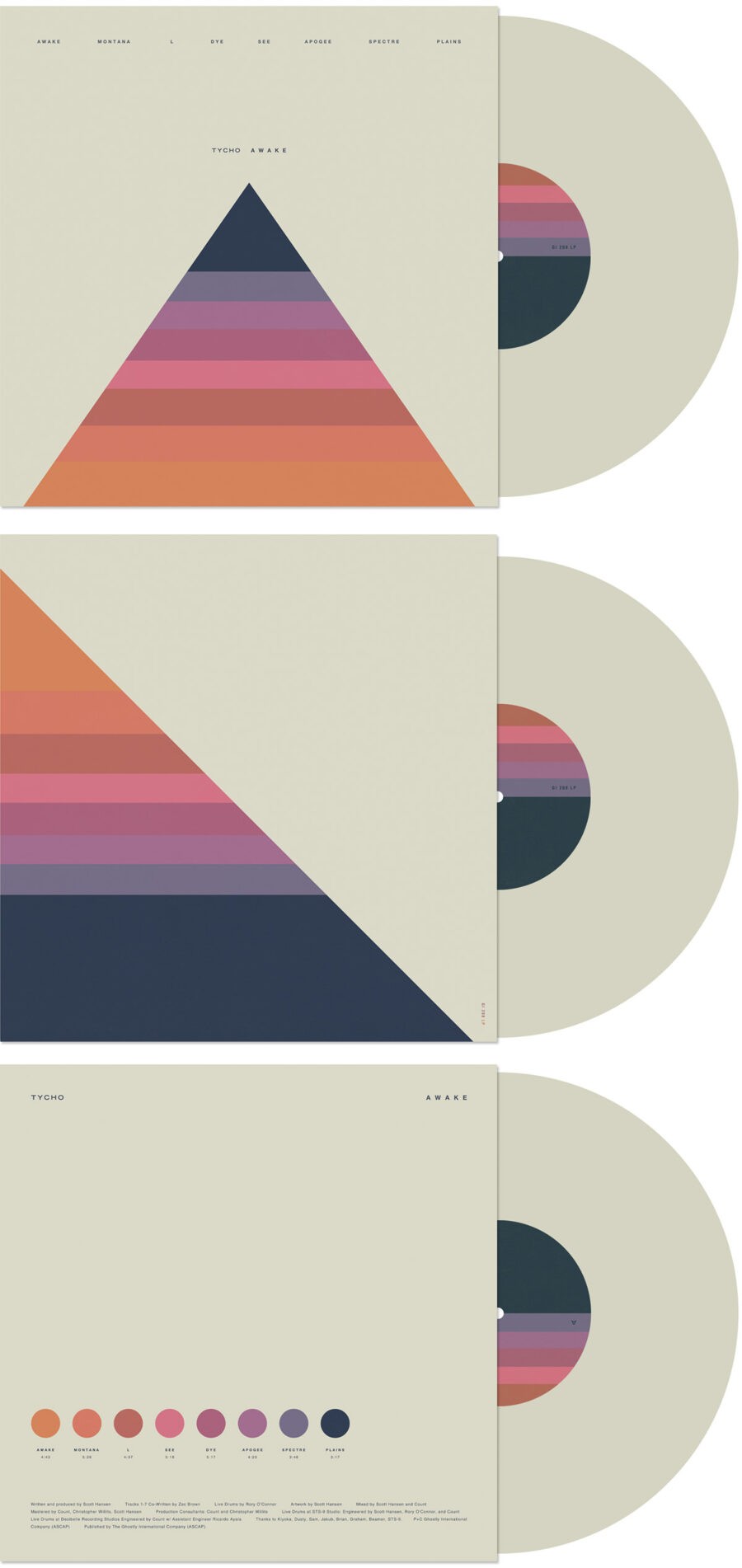
Fig.6 - Vinyl packaging
-
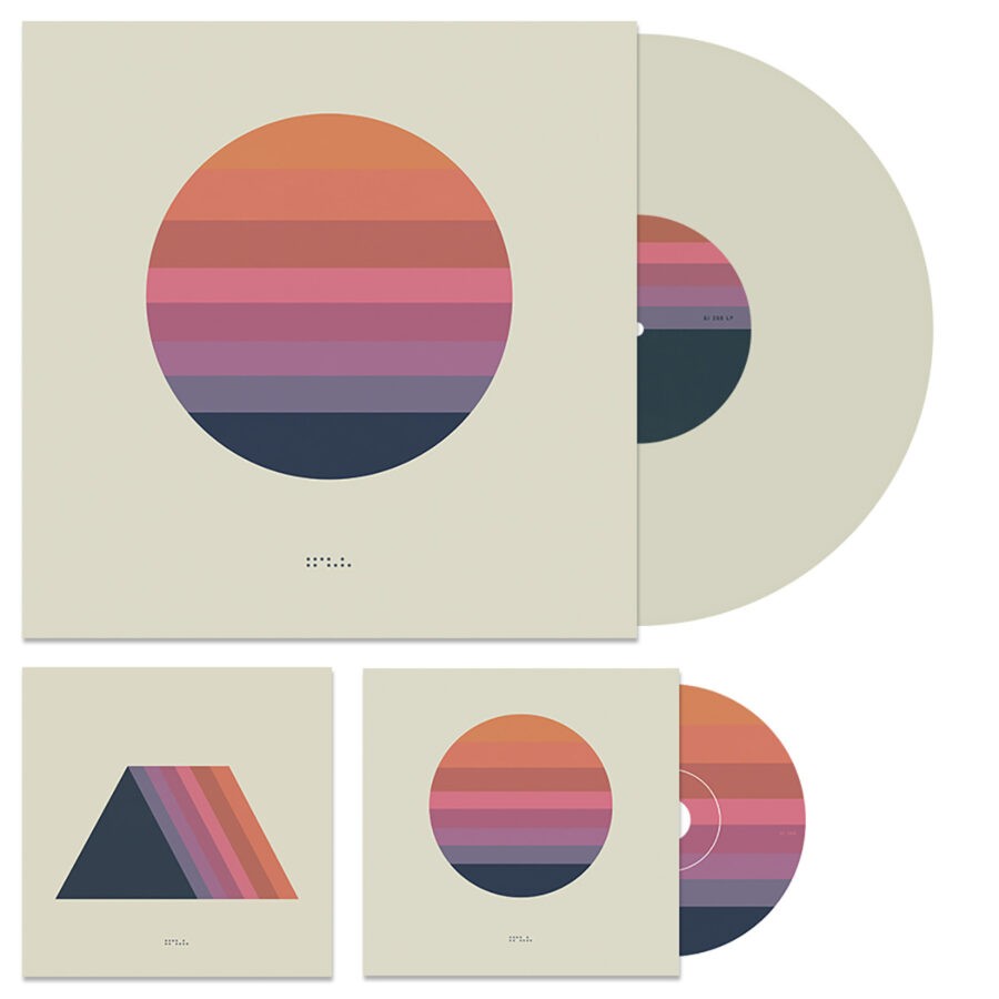
Fig.5 - Physical formats
-
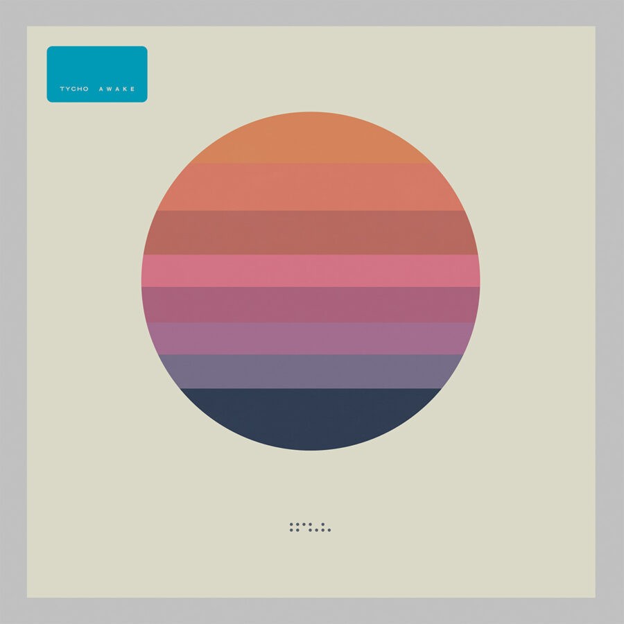
Fig.7 - US Vinyl package
-
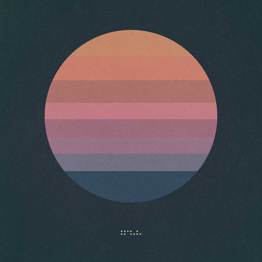
Fig.7a - Deluxe version cover
-
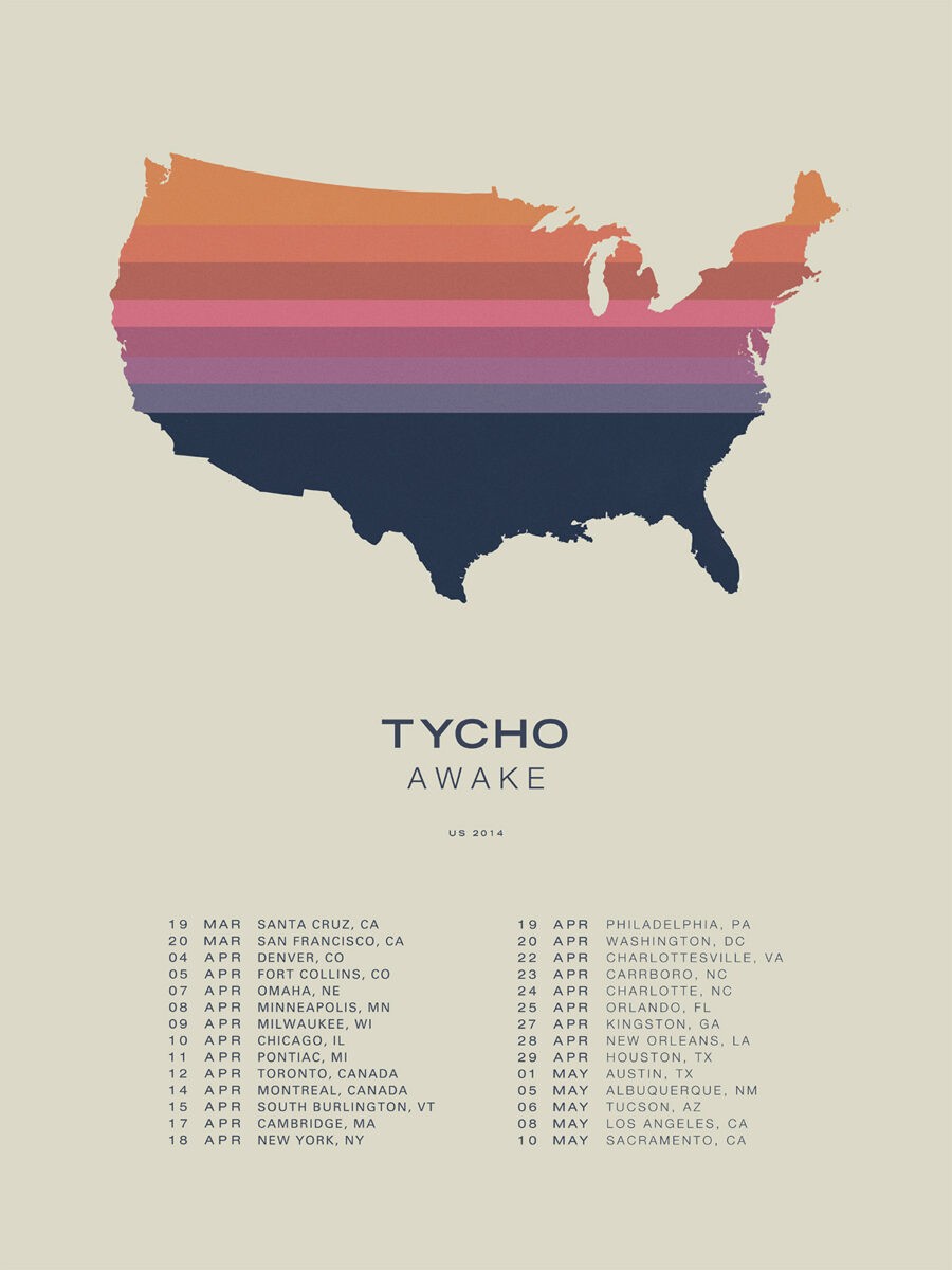
Fig.8 - Awake 2014 US Tour
-
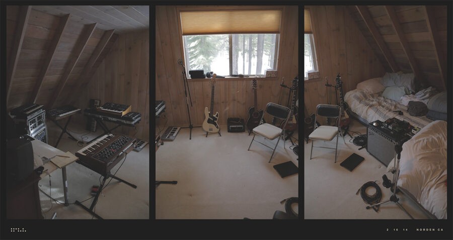
Fig.9 - Cabin where first Awake sessions were recorded
-
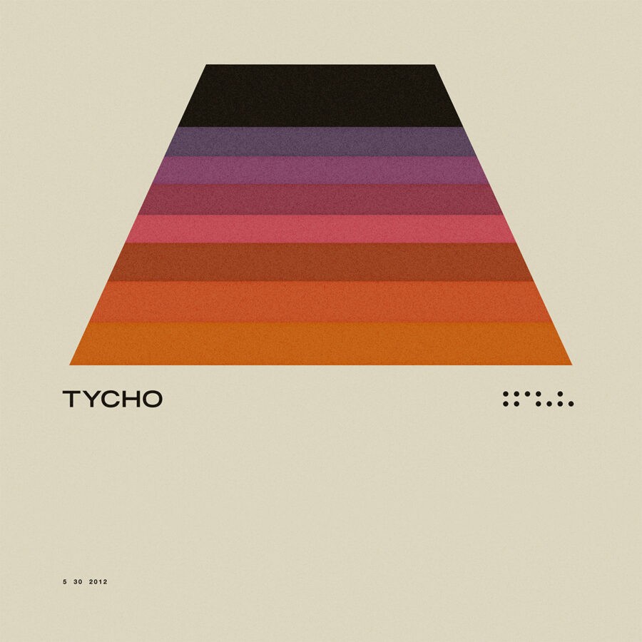
Fig.10 - Early use of color palette
-
Fig.11 - Early use of color palette
-
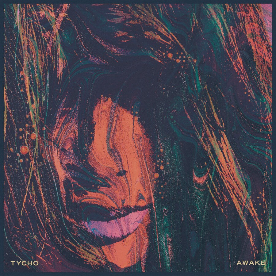
Fig.12 - Awake single artwork
Awake 2014
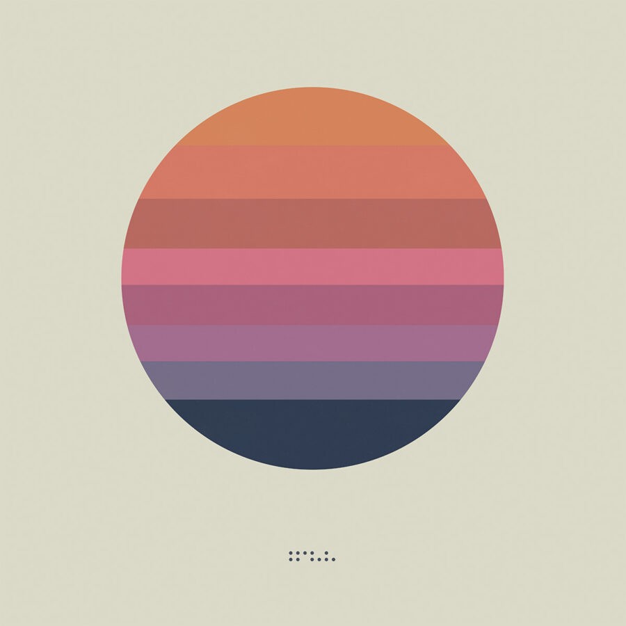
After the decidedly maximalist approaches taken with both the artwork and music of Past is Prologue and Dive, Awake was all about stripping things away and revealing an urgency that was obscured by the gauzy textures of my previous work. I have always been a huge fan of minimalist graphic design and the Swiss Style in particular but had spent most the previous 13 years of my career pursuing a kind of illustrative / photographic approach to design. I had been slowly moving in this direction for a while but with Awake I decided to go all in on minimalism and distill the message of this record into a simplified visual language that was portable and instantly recognizable.
This was more than just cover art to me, I was branding Tycho as a whole. I had spent much of my career as a graphic designer developing brands for companies and wanted to use this album as an exercise in visual identity. I wanted this artwork to transcend the album itself and be the visual manifestation of what Tycho meant to me. Whether I was successful or not is a whole other question, but I had a blast working on this and I was really happy with the results. Of all of my work I think this image and these colors have endured in a meaningful way.
The design started life as a series of show posters (fig.10 & fig.11) in 2012. I kept coming back to them and had placed them in a folder of potential covers for the album but was afraid it was too simple. When it came time to put out the first single, the title track, I still hadn’t decided on a direction for the album and was going back and forth between a few designs. So I worked up something that, while sharing some similarities in the color palette, now seems so out of place in the context of the campaign (fig.12). I remember one night Zac and I were relaxing after a recording session and I pulled up my deck of cover concepts. He was immediately drawn to (fig.10) and after a few drinks and some discussion we were confident this was the way to go. After that I had the confidence to take this and run with it.
The idea was to take the sun motif I had employed in Dive and distill it but shift from Dive’s sunset to a sunrise scene. I had been going to Burning Man for a few years at this point and was completely obsessed with the sunrise aesthetic of the Black Rock Desert. The Awake artwork is the iconography of Black Rock, the dusty background and the sun rising through the crisp morning air over an arid desert landscape. Although age brings wisdom, these years were the absolute pinnacle of my physical and mental strength, I was perceiving and channeling the world around me in a very pure and unfiltered way and this album is the embodiment of that experience for me.