-

Fig.0 - Deluxe version
-

Fig.1 - Original cover
-
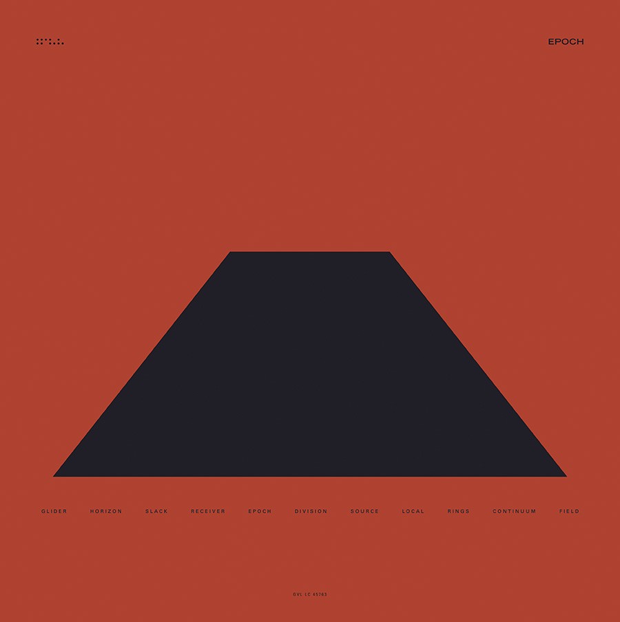
Fig.2 - Vinyl back
-

Fig.2a - Early concept
-

Fig.3 - Vinyl mockups
-
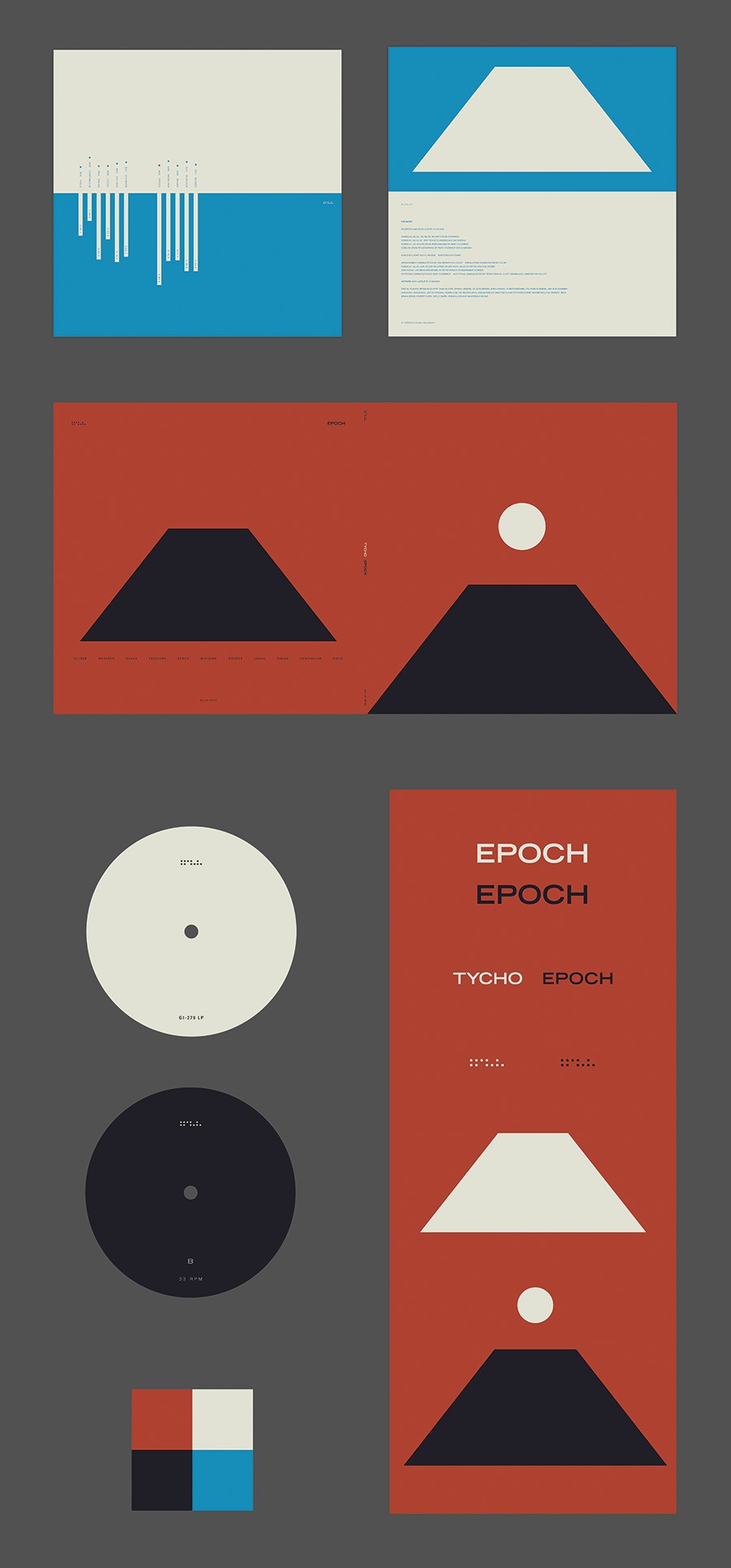
Fig.4 - Packaging
-
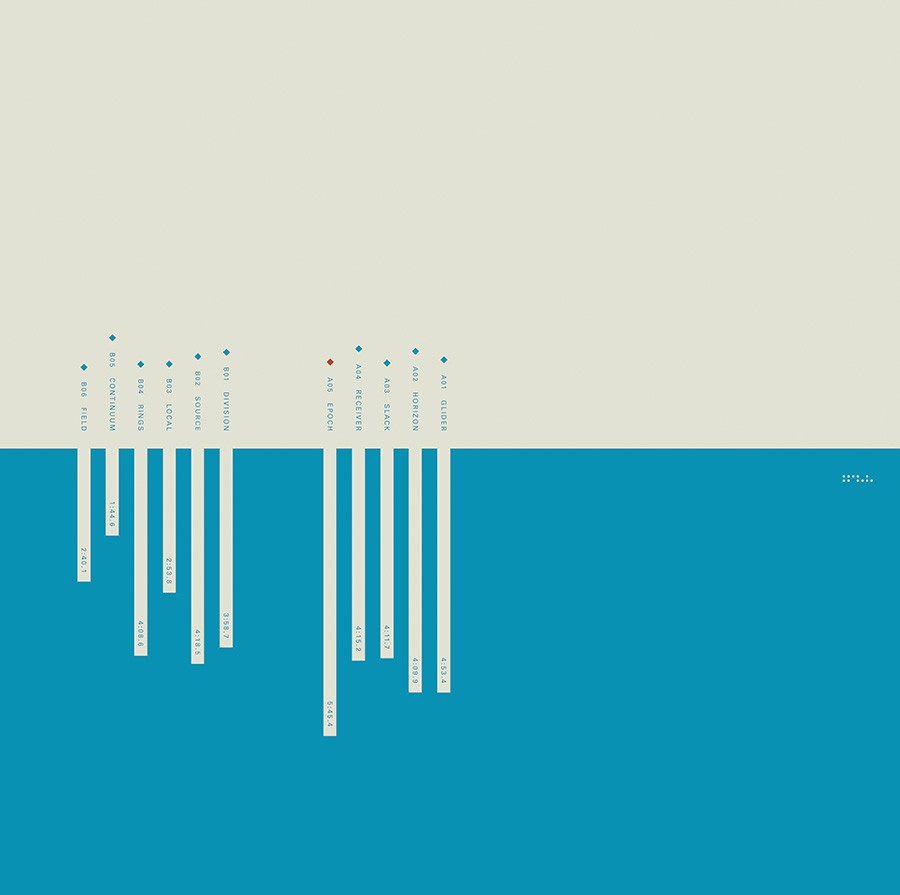
Fig.5 - Vinyl sleeve front
-
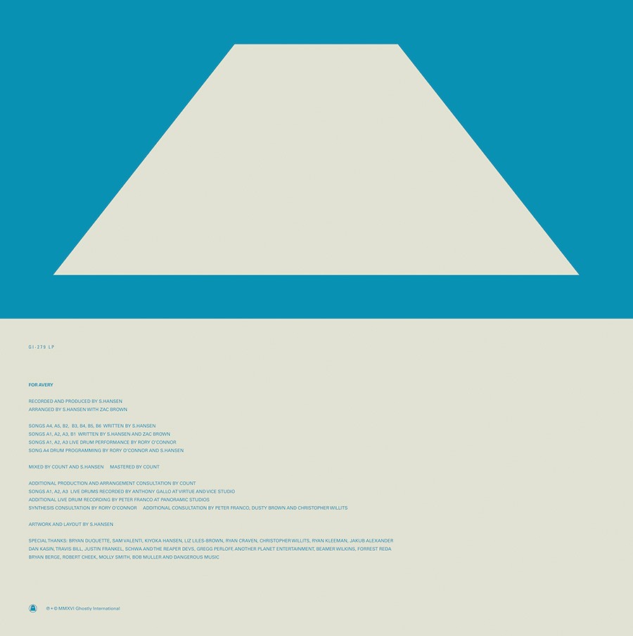
Fig.6 - Vinyl sleeve front
-
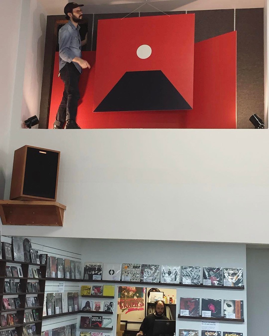
Fig.7 - Promo installation at End of an Ear Austin
Epoch 2016
Epoch was in every conceivable way an exercise in extremes. It was about stepping outside myself and trying to touch the edge of reality and peer into an unknown world. The album, to me, was cold and detached, evoking the feeling of being in an alien landscape and finding beauty in the nothingness. The album cover was an attempt to capture the feeling of walking a path to the edge and peering over it. While the sun had played a prominent role in the previous album covers, the moon is the central figure here signaling a turn toward darker themes.
I had been playing around with a lot of minimal concepts, wanting to distill the cover down to its most basic elements. I went back and forth between a shaded version (fig.0), versions with figures in the foreground (fig.2a) and the version that was originally released (fig.1). I ended up going with the more minimal version for the original release as I felt it lent itself better to the overall concept of the packaging (fig.3) but in hindsight I think the more detailed version (fig.0) tells the story a little more clearly. All in all it was an incredibly rewarding process working through different permutations of the cover art for the various promotional elements of the campaign. Although a lot of the work from this period was very simple in form I think I learned more about color theory than at any other time in my career.