-
-
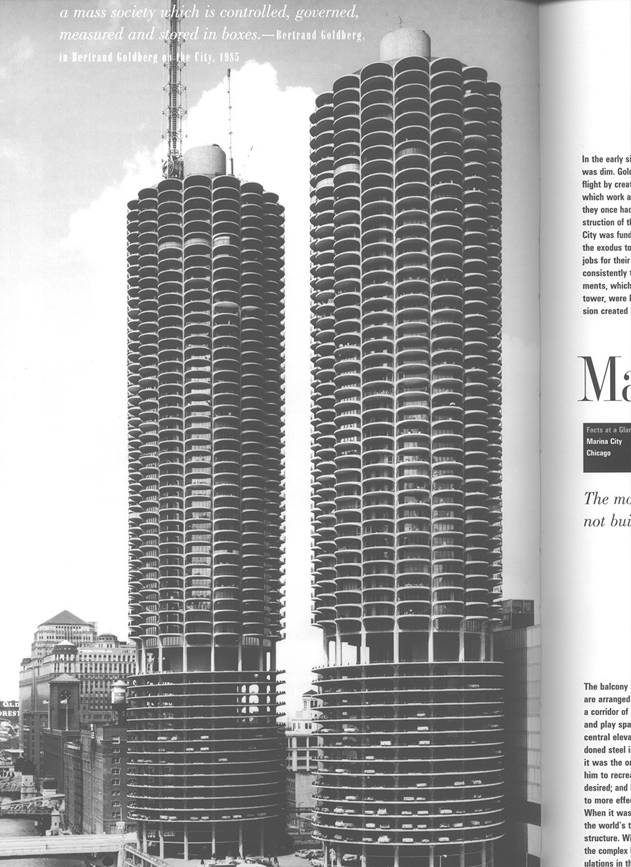
Fig. 0a - Photo
-
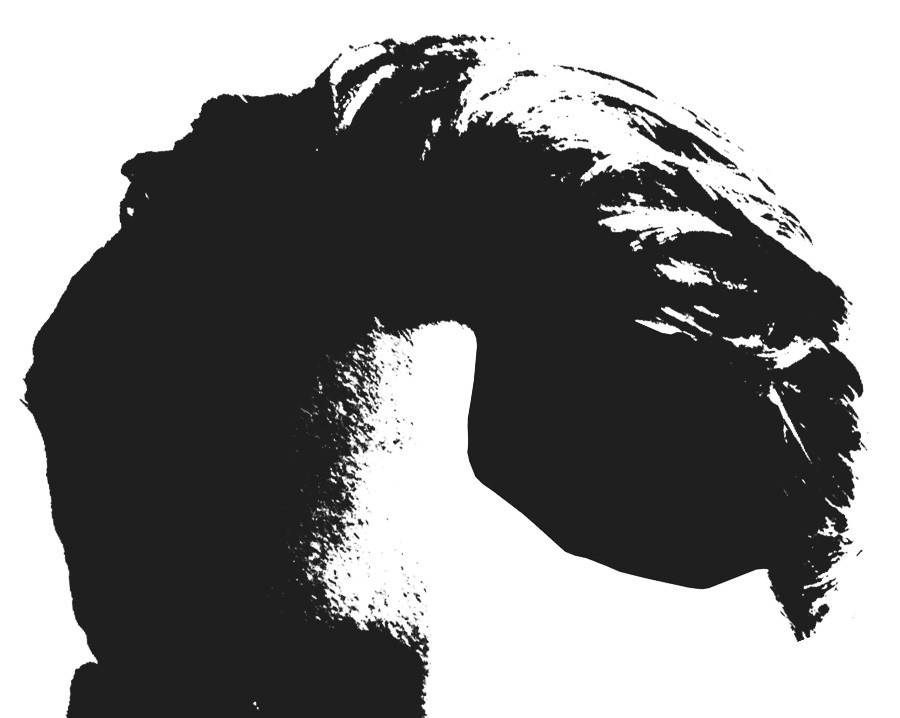
Fig. 0b - Hair texture
-
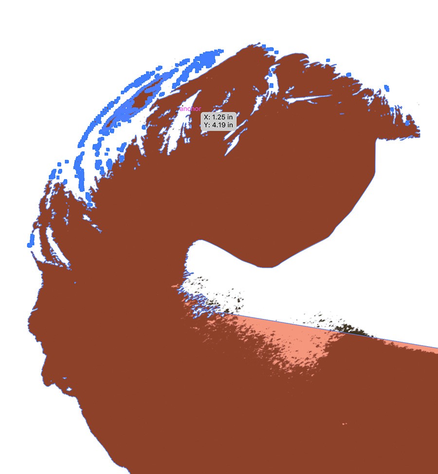
Fig. 0c - Hair texture vector traced
-
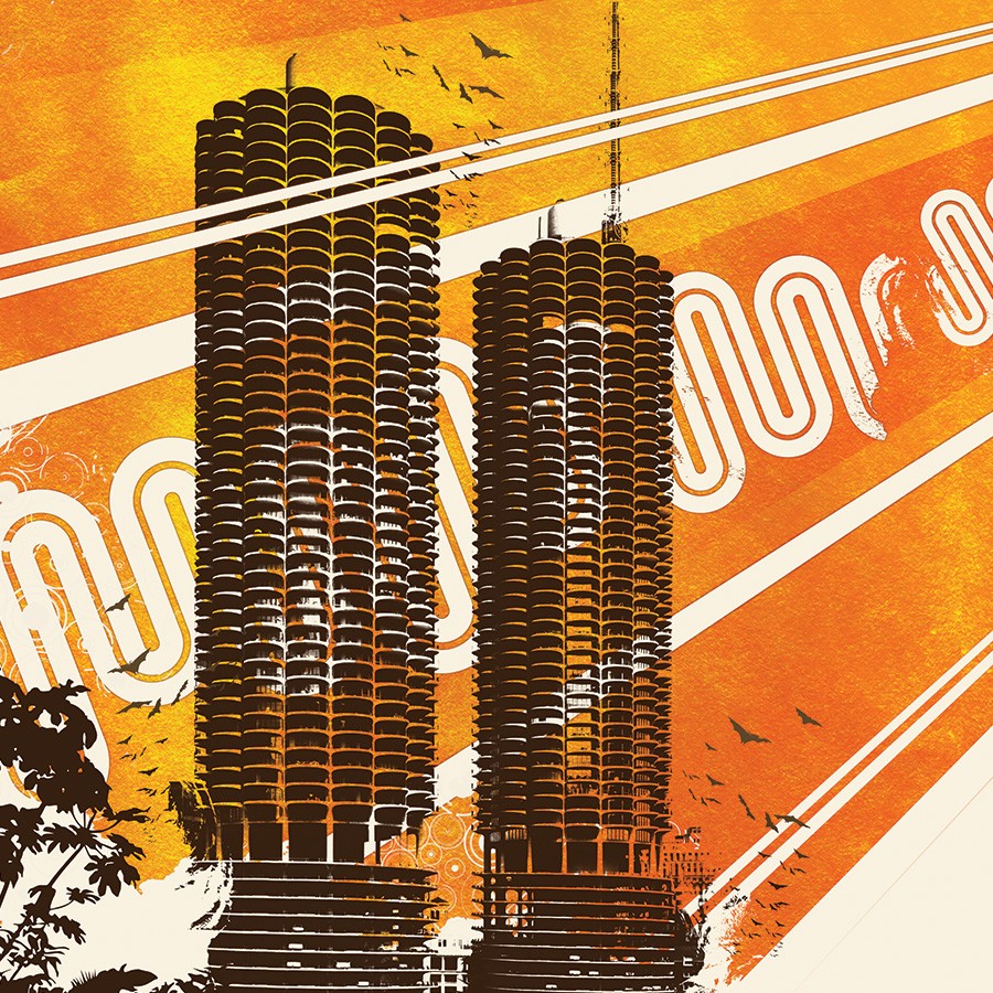
Detail
-
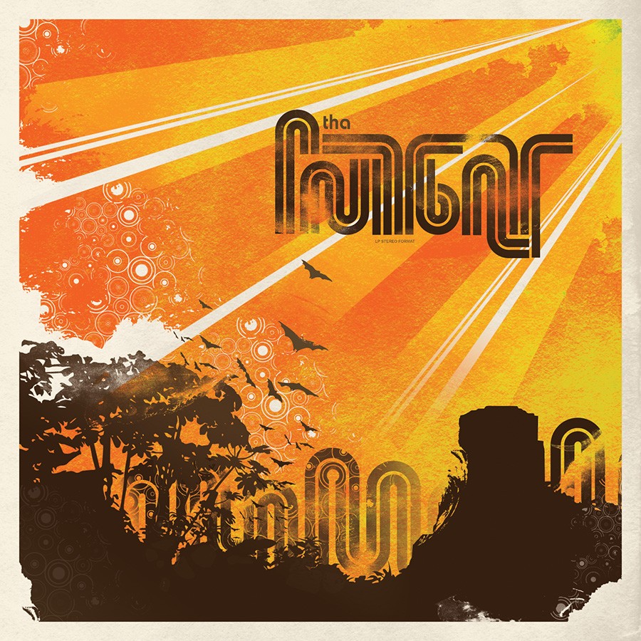
Fig. 1 - Tha Fruitbat Cover Art
-

Fig. 2 - Tha Fruitbat CD
-
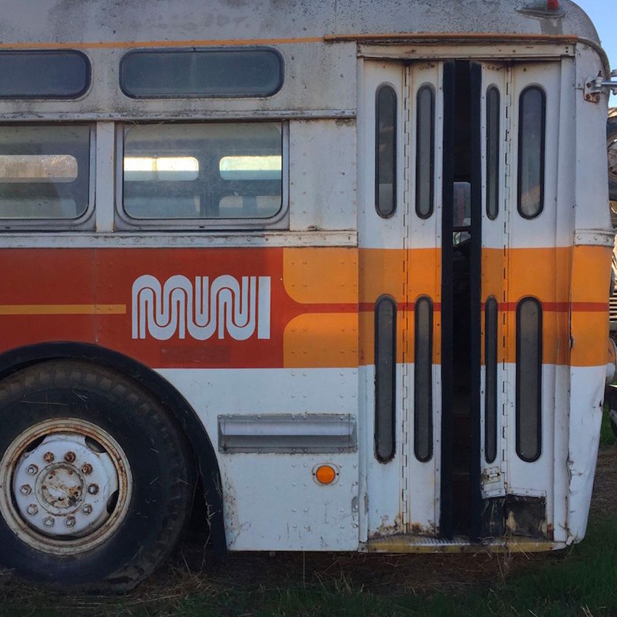
Fig. 3 - MUNI logo on bus (via MUNI Diaries)
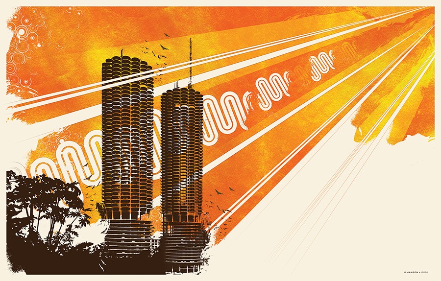
Marina 2004
This image started life as a cover for my friend Evan’s ‘Tha Fruibat’ project. I was really inspired by the Muni logo and colors (fig.3 via photo via) when I lived in San Francisco in the ’90s and wanted to reference that.
I later decided to adapt the image into a poster but without the word art it felt like something was missing. I had a book about skyscraper architecture and loved the look of the Chicago Marina Towers so I vector traced an image (fig.0a) of them to complete the scene. Here you can see I’m still working out the kind of “page is tearing away” negative space concepts from Sunrise Projector and Past is Prologue.
After using floral vectors for a while I was looking for something that felt more like a brushstroke, but not quite as literal and stumbled onto a solution using a picture of my hair (fig.0b). I traced it in vector and laid it into the edges, ended up using this texture for a lot of work around this time.
See Avian for more info on the process of creating the gradient mapped background.