-
-
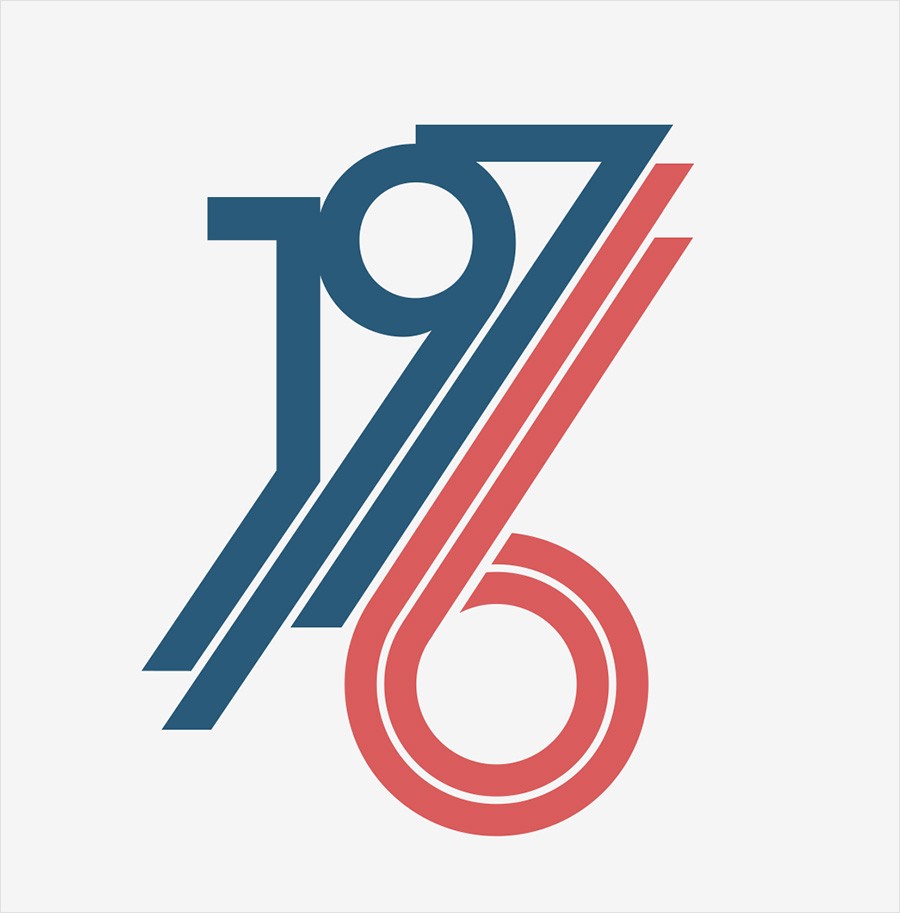
Fig. 1 - 1976 design
-
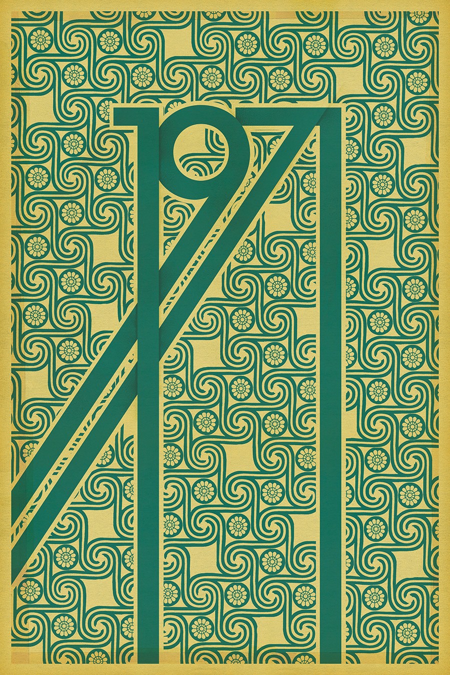
Fig. 2 - Original version
-
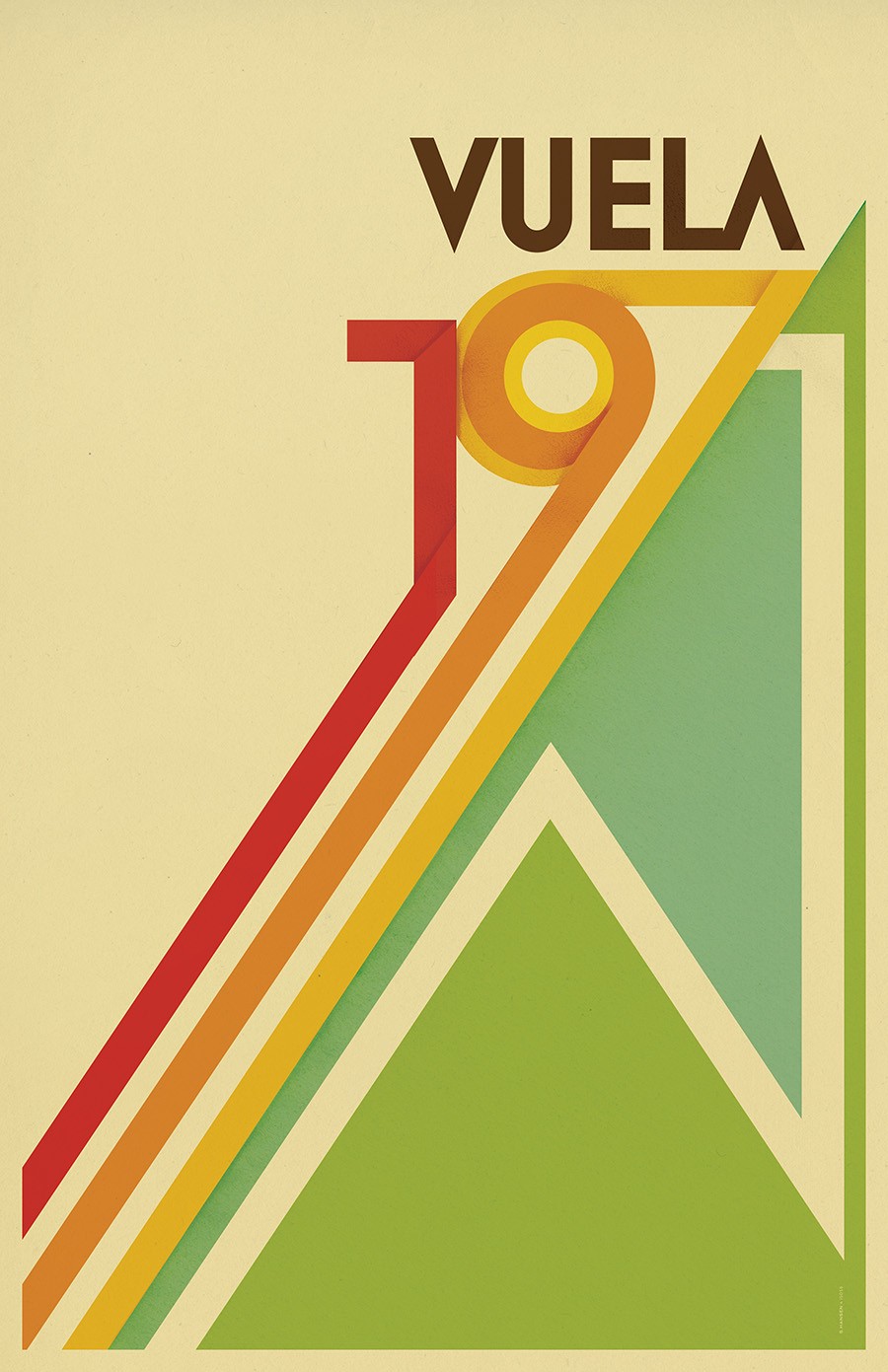
Fig. 3 - Vuela Variant
1971 2005
Unlike the majority of my work from this time, 1971 one was purely an exercise in design. This was at the height of my “type as a design element” phase. After doing mostly show posters I remember feeling really freed by this, not having any specific messaging requirements, just making something that looked interesting. I had originally designed this using a lot more texture overlays and tape effects (fig.2) but ultimately landed on a more minimal approach to let the design breathe.
The plan was to do a design for each year in the ’70s but I got as far as doing a 1976 shirt (fig.1) then got bored. A year or so later on a trip to Spain to speak at the OFFF graphic design festival I got inspired and did the “Vuela” variant (fig.3)