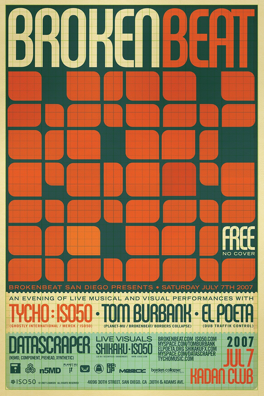
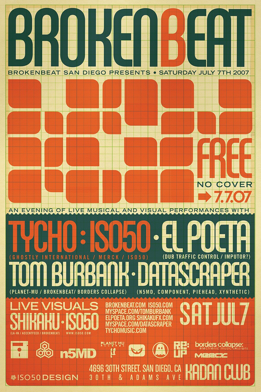
Broken Beat 2007
This work in particular always felt like a kind of dividing line between the overlay styles I had been using for several years and my later, more refined overlay styles. I had been really into using graph paper overlays while designing as a more pleasing alternative to the photoshop grid. sometimes when the design was complete I felt like the grid looked good left in place. I typically hated when promoters sent me the copy for a flyer and it included endless text and logos but I saw this project as an opportunity to hone my layout skills and use the type as a design element.
I was waaaay into House Industries’ Chalet Comprime typeface at the time and it found its way into a lot of my work. I felt like it locked up so well and the condensed version lent itself to images like this where a lot of text had to be displayed while still being aesthetically pleasing and connecting with the overall design.