-
-
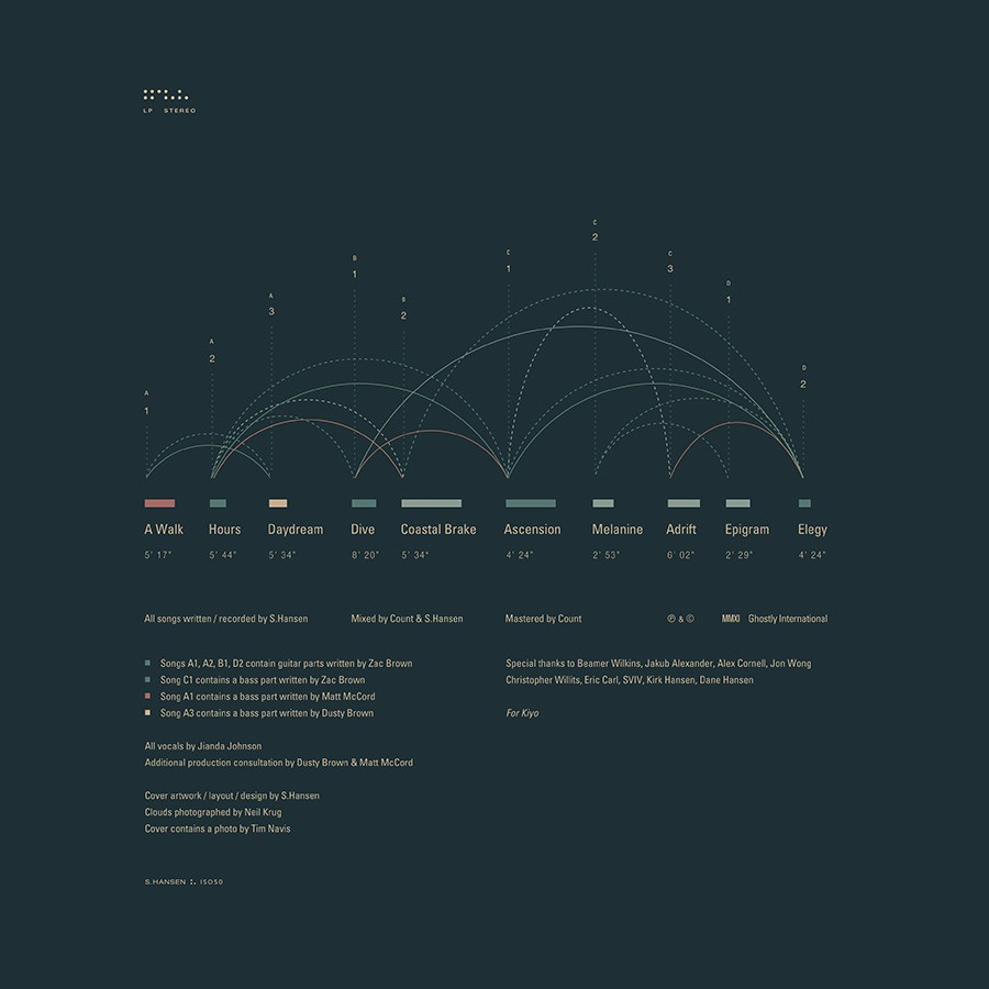
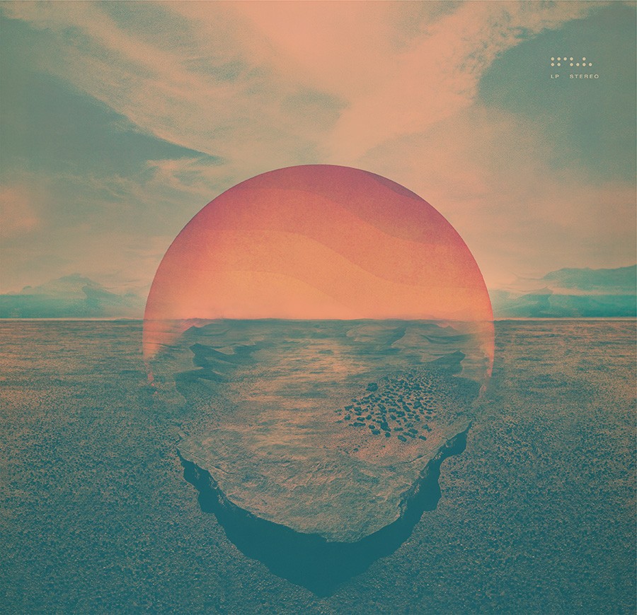
Fig.1 - Inner vinyl sleeve
-
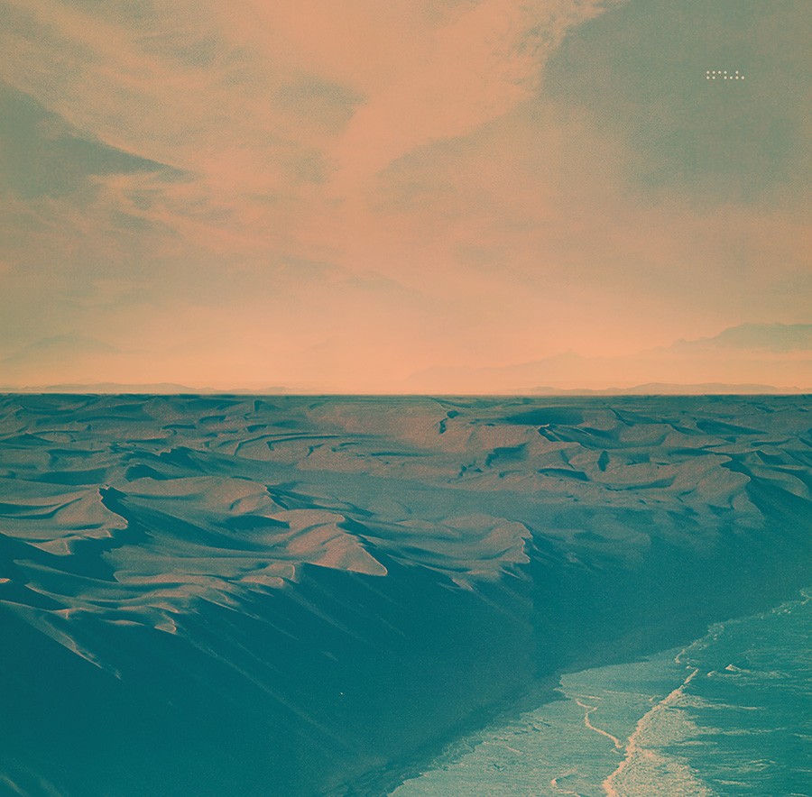
Fig.2 - Vinyl sleeve back
-
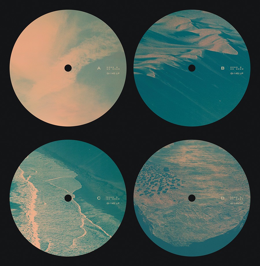
Fig.3 - Vinyl stickers
-
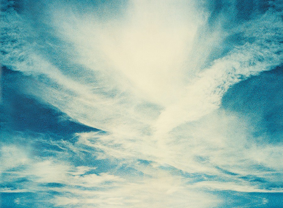
Fig.4 - Clouds from photo by Neil Krug
-
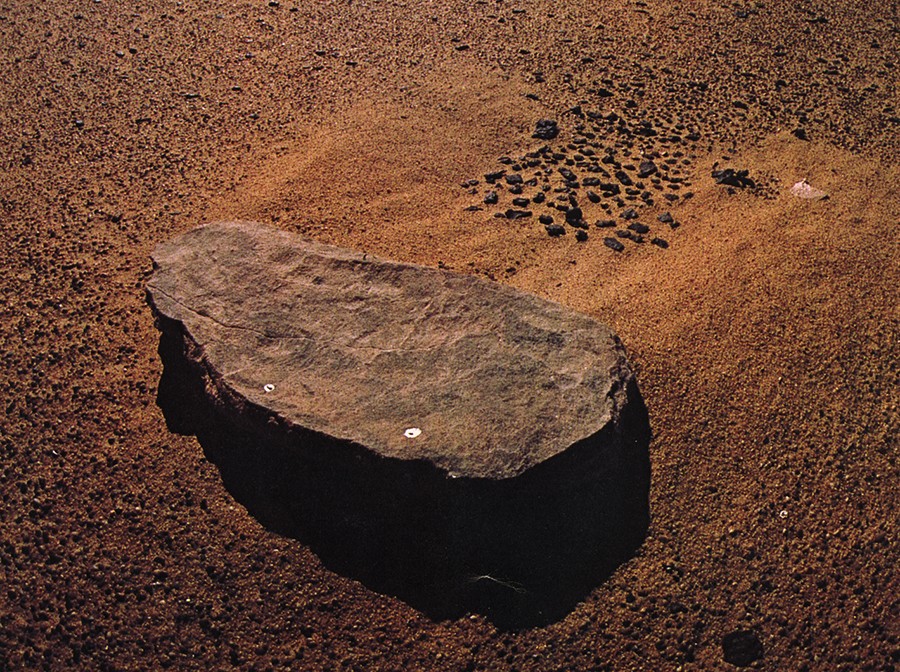
Fig.5 - Rock photo
-
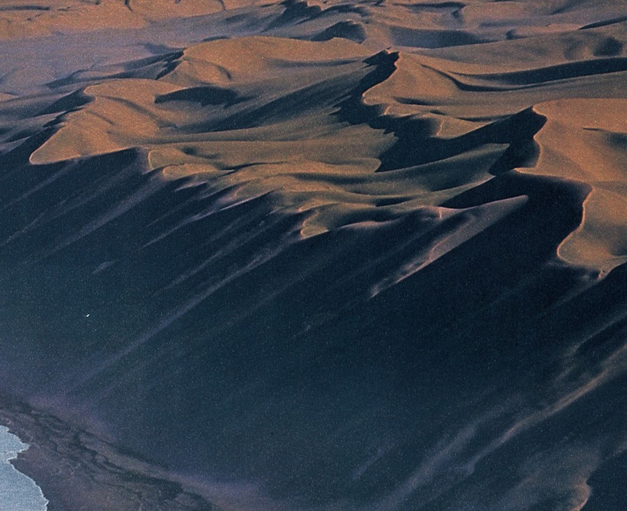
Fig.6 - Dunes photo
-
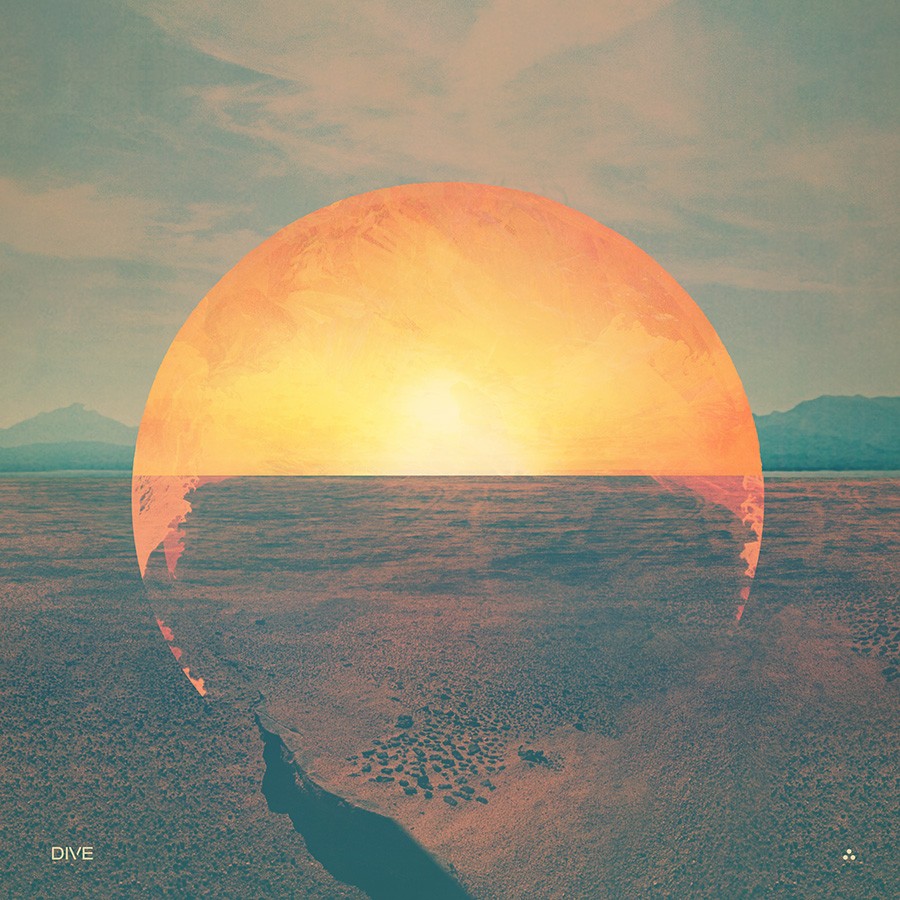
Fig.6b - Early concept
-
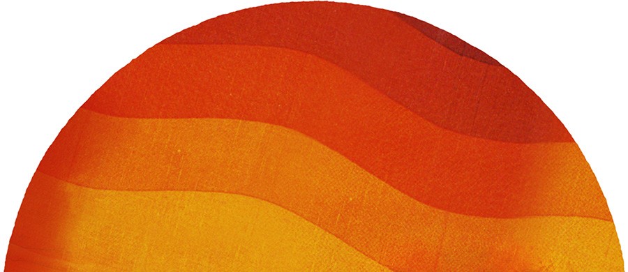
Fig.7 - Sun composite
-
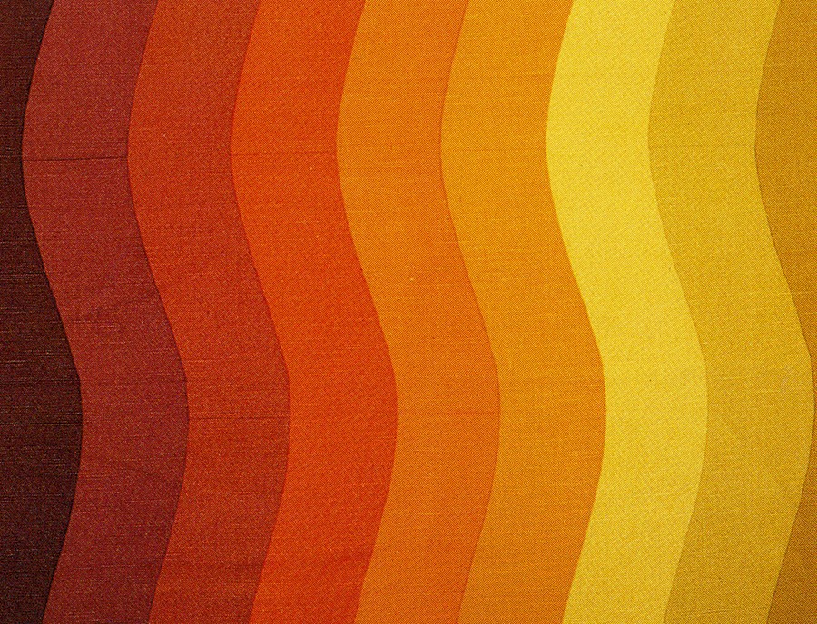
Fig.8 - Textile scan used for sun
-
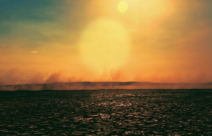
Fig.9 - Photo by Tim Navis
-
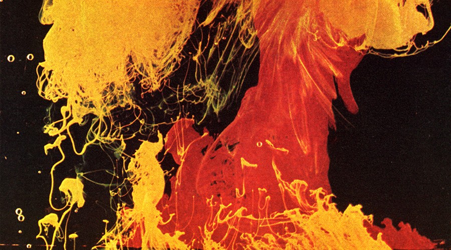
Fig.10 - Oil image
-
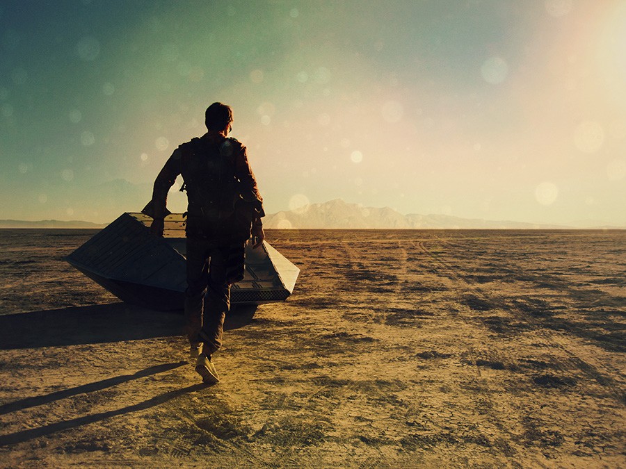
Fig.11 - Self portrait
-
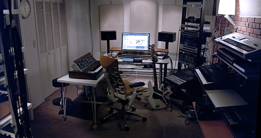
Fig.12 - San Francisco studio during Dive era
-
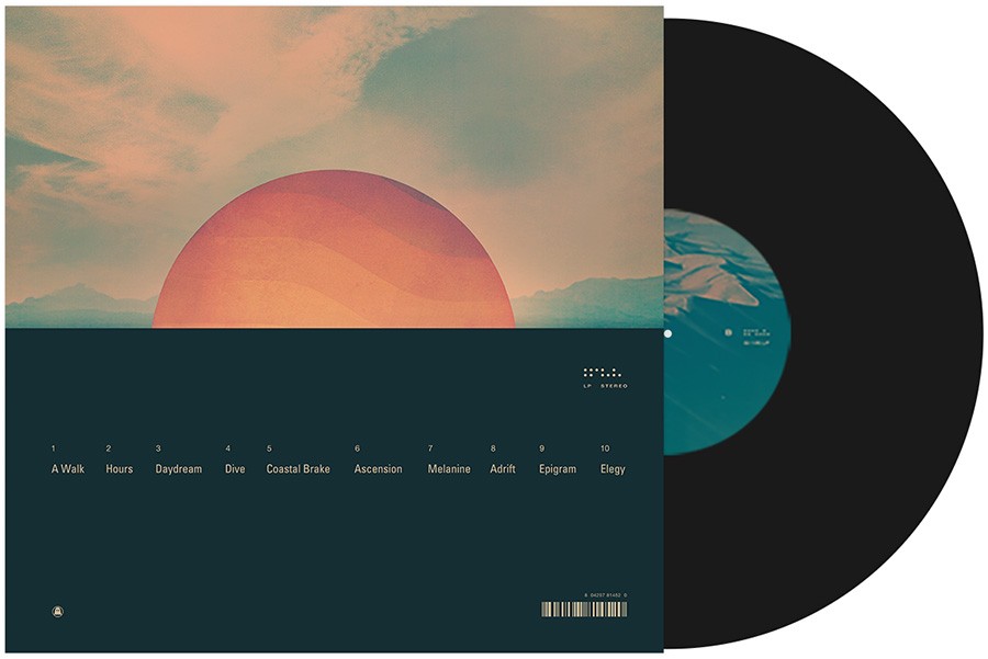
Fig.13 - Vinyl package
-
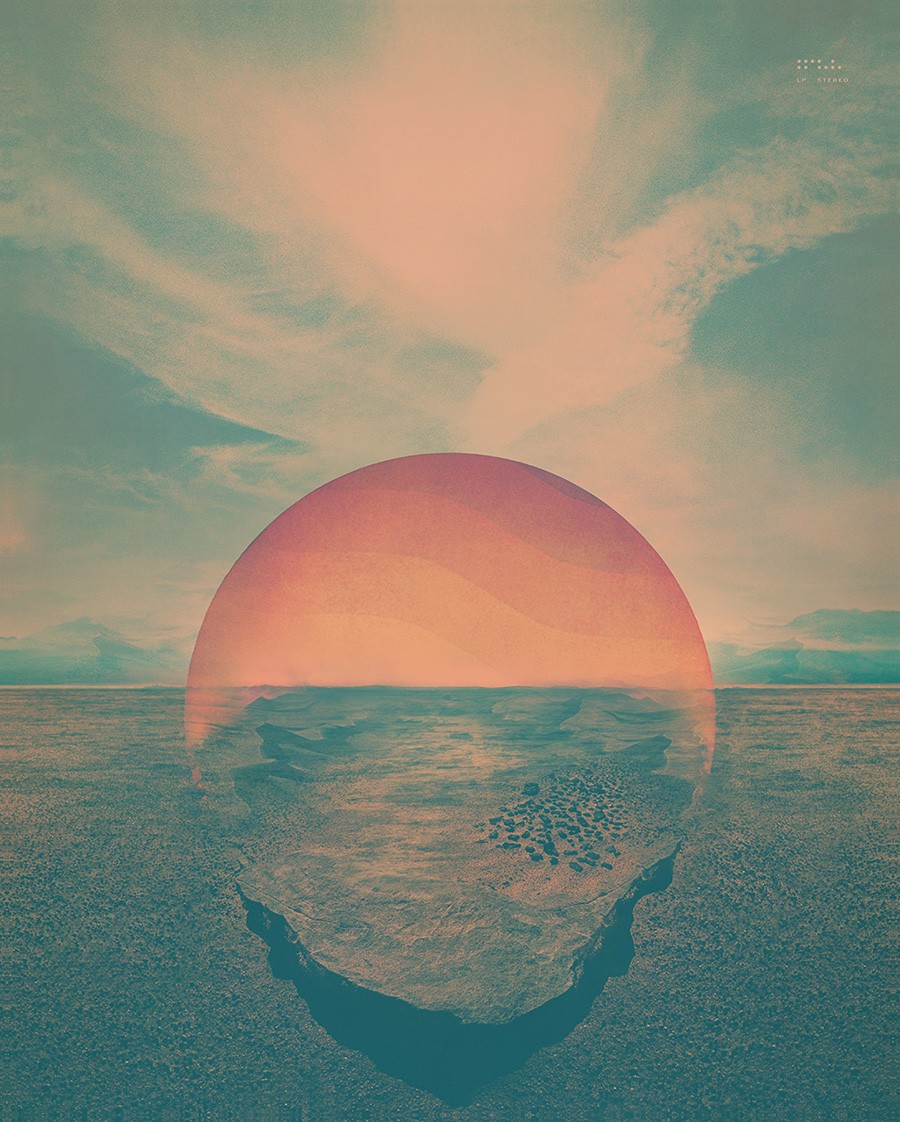
Fig.14 - Poster
-
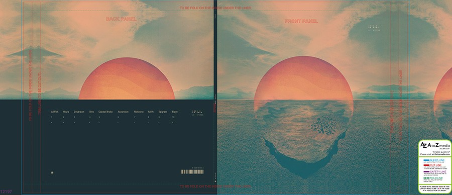
Fig.15 - Vinyl packaging template
-
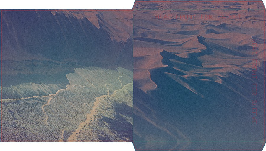
Fig.16 - Vinyl sleeve template
-
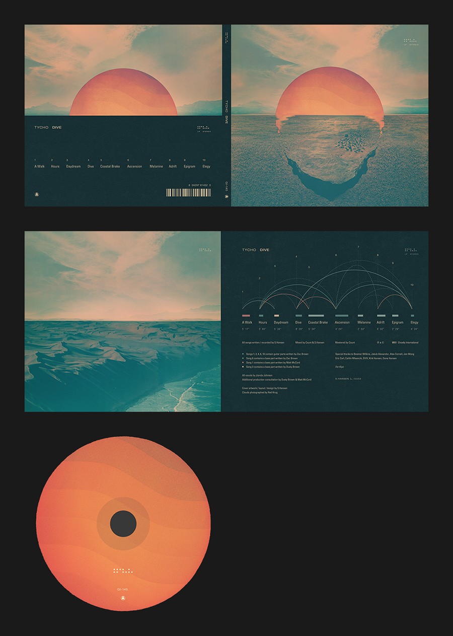
Fig.17 - CD packaging
-
Fig.18 - CD sleeve
-
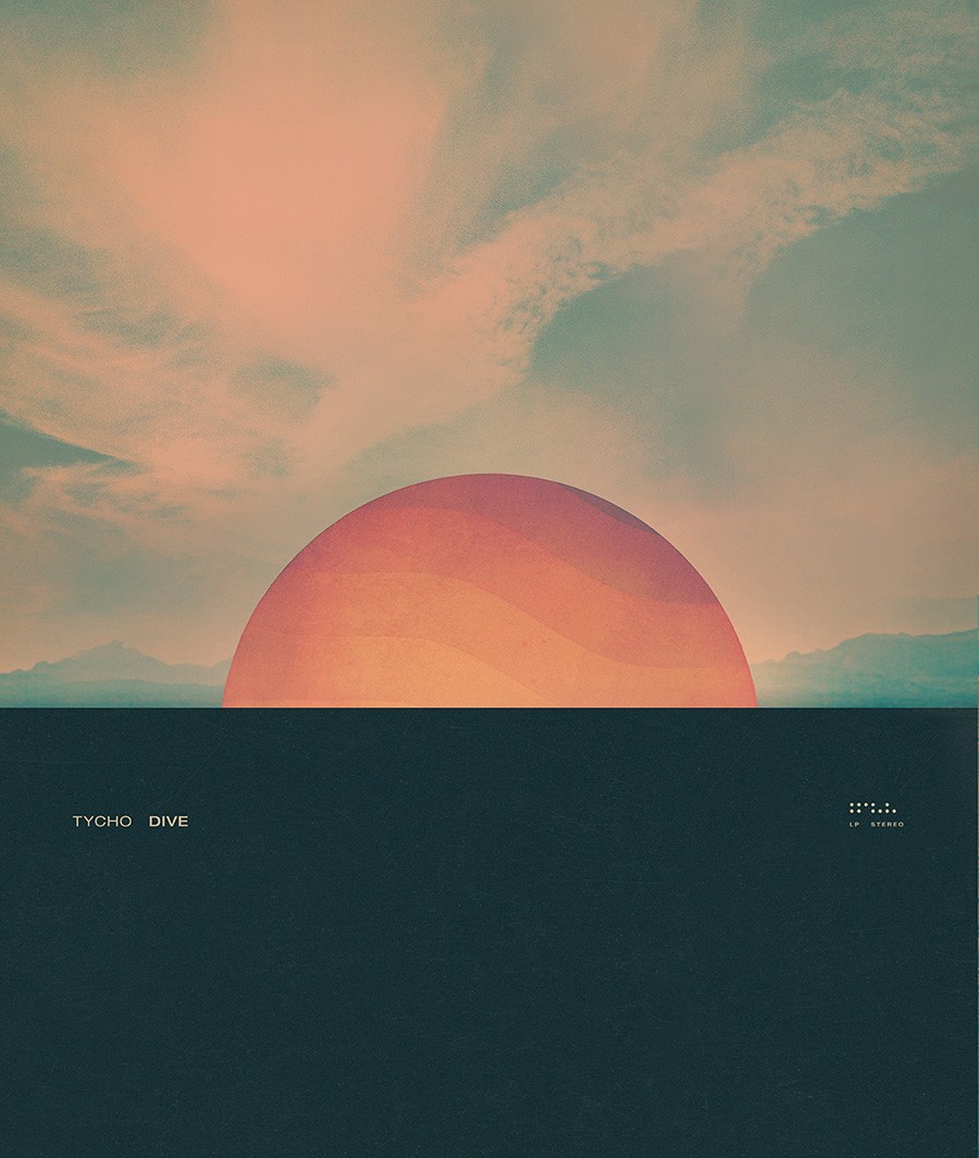
Fig.19 - Poster 2
-
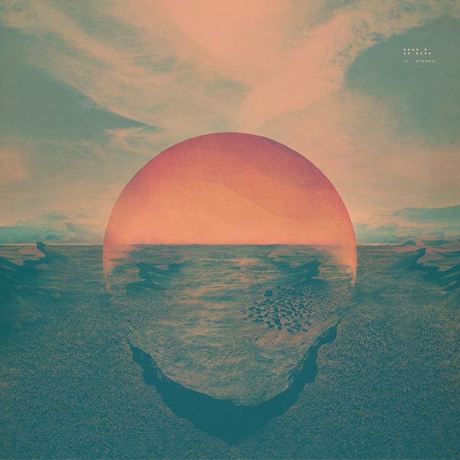
Fig.20 - Version with dunes on right/left horizon
-
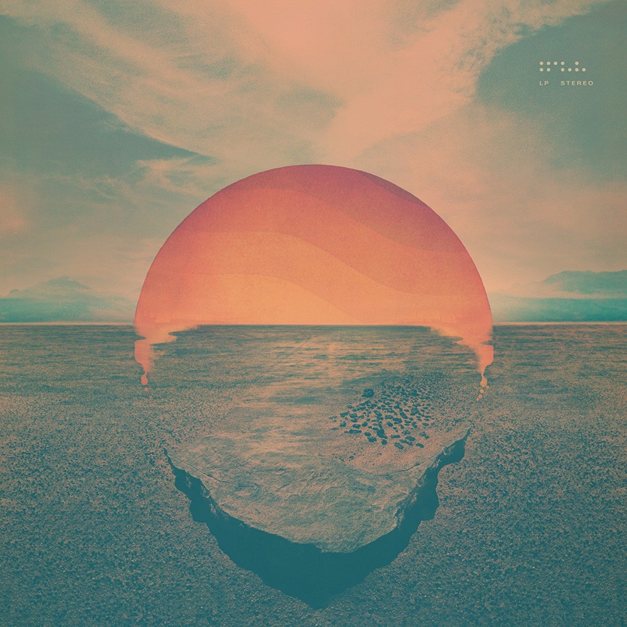
Fig.21 - CD artwork version
-
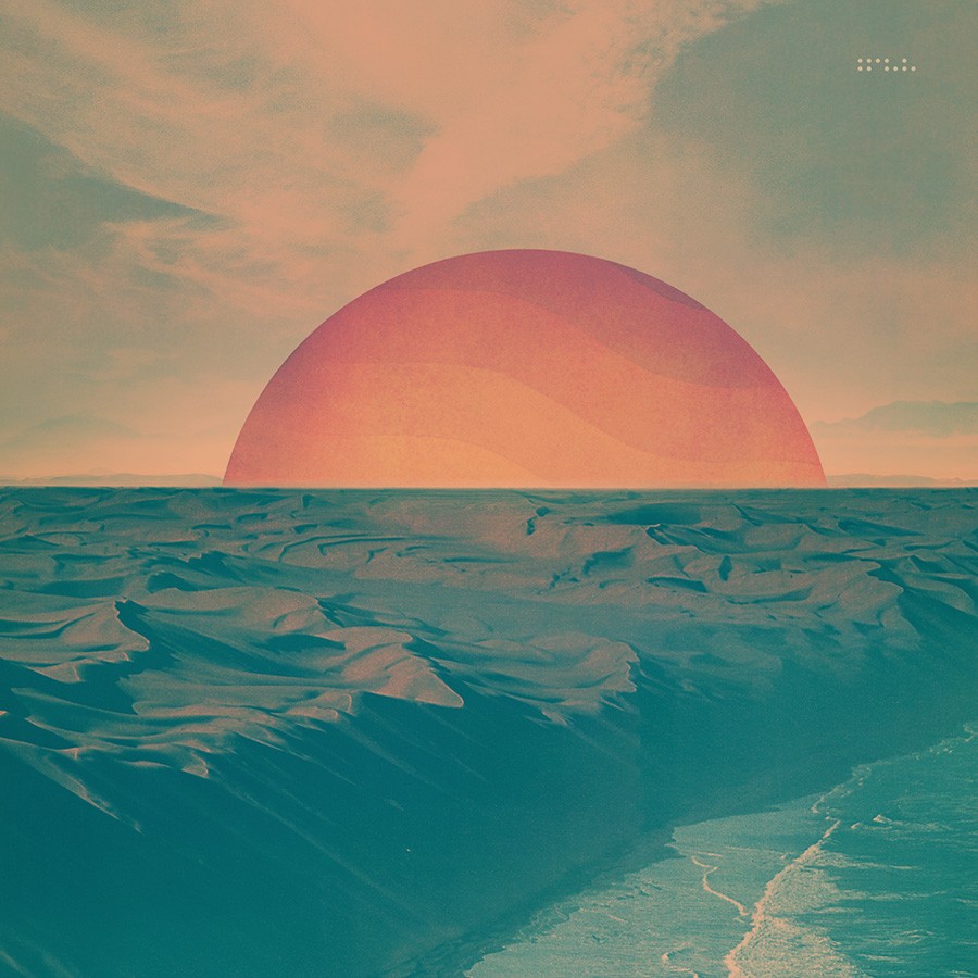
Fig.22 - Alt liner
Dive 2011
I’ve always seen Dive as the center point of my journey as an artist. It brought to bear all of the skills and concepts I had developed in the decade prior and was the dividing line between my careers as a professional graphic artist and a professional musician. It was my first album on Ghostly International and marked the beginning of my touring career, up until this point I had just been doing smaller one-off shows here and there. It was the beginning of the modern era of Tycho and the album that introduced the project to a much wider audience.
After Past is Prologue came out I had started making demos for the next album. I was still living in Sacramento and caught the attention of record label Ghostly International. Shortly thereafter in 2006 I moved to San Francisco and over the next 4 years stayed pretty busy with the ISO50 blog, shop and graphic design in general. But during this time I was always working on music on the side, further developing the demos and writing more material, slowly refining and arranging things. In 2010 I decided to focus completely on music and spent the next year completing Dive, but it was really the product of 5 years of on and off writing and work.
Like the album, the artwork was an exercise in refining the maximalism I had been exploring earlier in my career. I started on it after the album was complete in June 2011. I wanted to do a photographic composite to create an image that felt simultaneously realistic and synthetic. The initial concept (fig.6b) was a lot more vivid and purely photographic, and while there are actually some elements of this version I still prefer, ultimately I decided it didn’t speak as well to the music itself. I wanted it to be more muted, darker, like there was a layer of atmosphere between the viewer and the image. The whole album was supposed to feel like a faded memory mixed up with a dream so I tried to push things into a more gauzy, less defined space.
I also wanted to incorporate some surreal elements, juxtaposing water themes against the desert with a sun setting into the horizon but partially in front of it. I played a lot with how to blend the sun into the foreground, in fig.21 you can see an early attempt. I remember the CD artwork was due early for some reason and I had to send it out with the fig.21 version, which I really wasn’t happy with, as that’s as far as I had developed things. Luckily I had another week to complete the vinyl and digital versions and was able to land on a more refined solution for the blending of sun and horizon.
The image is a composite of many, many images and I’ve included a few here. Some interesting notes: The clouds are from a photograph by Neil Krug (fig.4) who generously let me use them. Some of the foreground elements are from a photo by Tim Navis (fig.9) taken while we were shooting press shots on a dry lakebed outside Los Angeles the year before. The vague tire tracks are from a self-portrait I took at Burning Man (fig.11), I wanted it to feel like there was a path drawing the viewer over horizon and the tracks of art cars on the playa seemed like a perfect way to accomplish this.
Overall this was the most complex project I’ve ever completed (the cover PSB file alone is over 10GB!) and remember it being a particularly enjoyable process, which is rare for me when it comes album package design which can be tedious and nerve-racking. This period in my life was a high water mark and a time of so much growth and change, I think the music and art reflect that.
Original blog post here