-
-
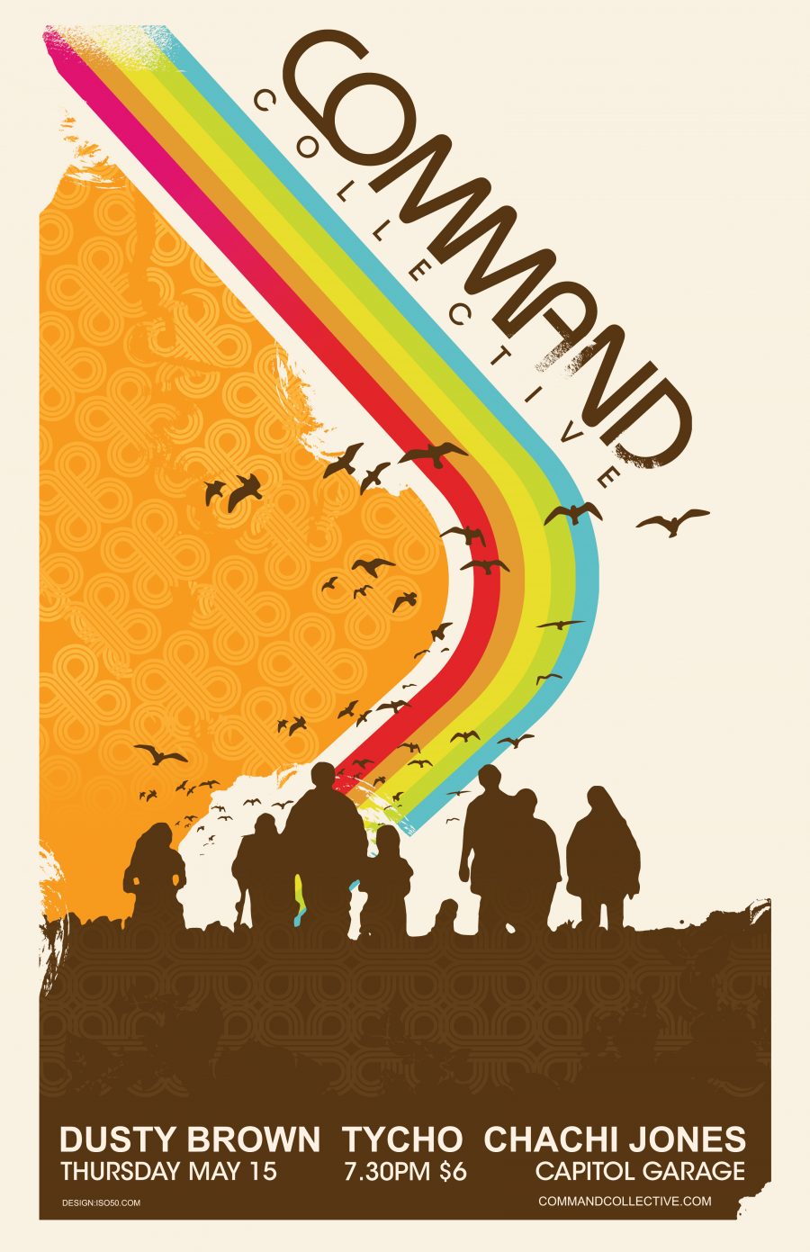
Fig. 1 - Original Flyer
Command 2003
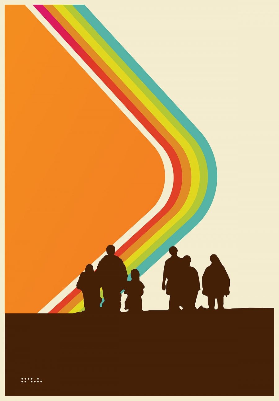
This image has always felt like the visual archetype for Tycho / ISO50. It encompassed everything I was trying to communicate with design and music and defined a color palette that would serve as the core of my work for many years. This marked the first time I started using a kind of dusty cream color instead of white, to simulate aged paper. I originally created the piece as a poster for a Command Collective show (fig.1), a series of shows and an artist collective we formed in Sacramento in 2003. I would get these printed up for free after hours by a friend who worked at a print shop and then would go wheatpasting them up all around the Midtown area. I was really inspired by Shepard Fairey’s work and all the stories I had heard about his wheatpasting adventures. I remember being really excited about this show because it was at Capitol Garage, my first show in a “real” venue in Sacramento.
As with a lot of my prints, I refined and simplified the design over time, trying to distill it to a pure message without any extraneous elements. I had made the original during a time I was focused on distressing and painterly effects for edges but as I spent more time with the image I realized the core elements in their most pure form were more powerful on their own.