-
-

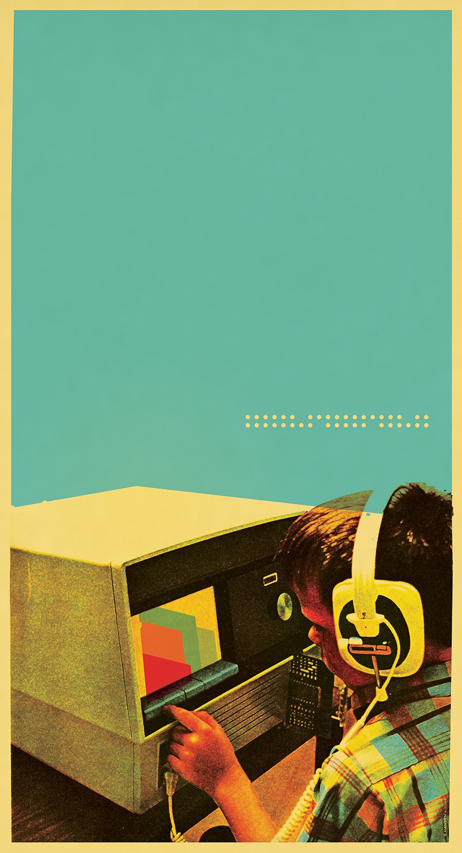
Fig. 1 - "Dots" logo
-
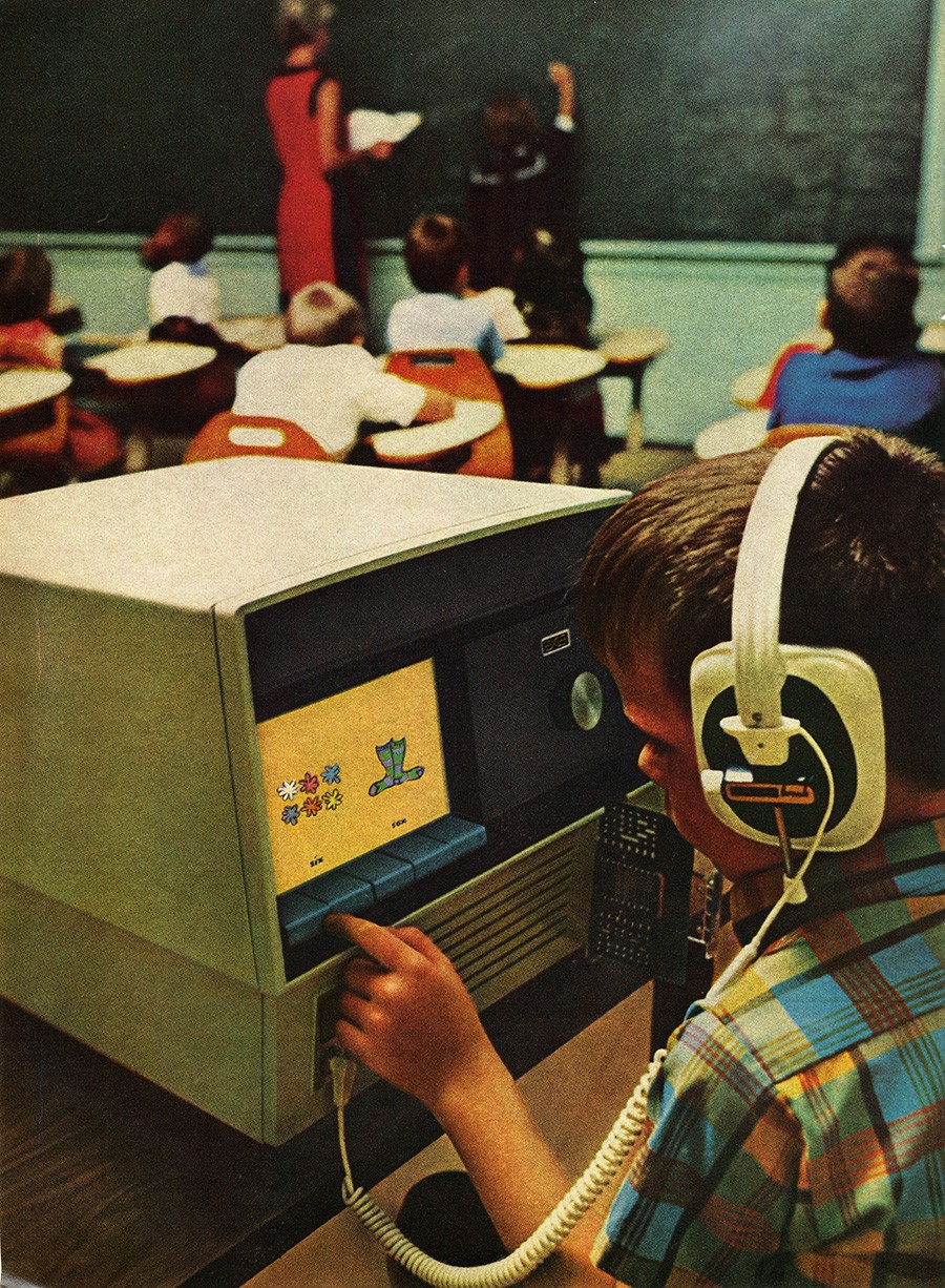
Fig. 2 - Original photo
-
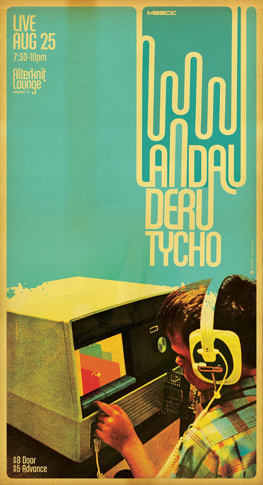
Fig. 3 - Original flyer
-
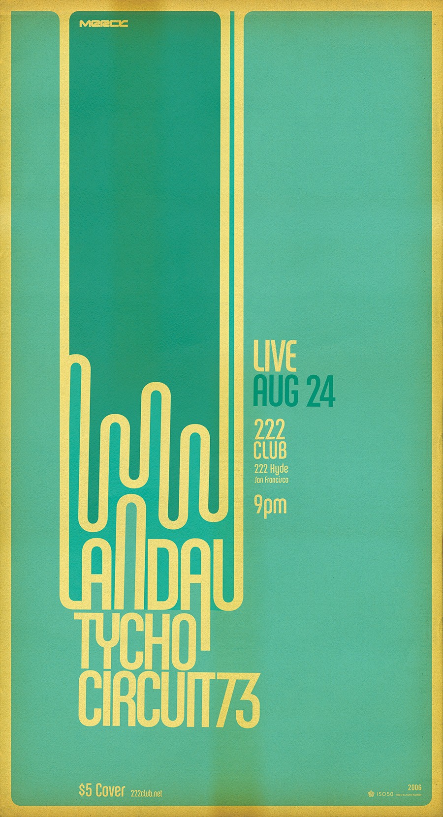
Fig. 4 - Alternate flyer
Knitting 2006
This was a continuation of the photo/graphic style I had been developing for a few years (Madrone is another notable example) and relied heavily on large fields of solid colors juxtaposed against photographic images. I had found this photo of a kid using an educational computer (fig.2) in a ’60s issue of Newsweek and was fascinated by the time period and aesthetic it conjured up.
My dad was a civil engineering student at Sacramento State in the ’60s and had kept a lot of his computer punchcards, paper sheets with holes in them used to program old computers. As a kid I played with them and imagined what the coded holes in the paper meant. With the dots here I was trying draw from that experience and introduce a kind of ambiguous design element that hinted at a hidden meaning. I Ended up liking the dots on their own and playing around with them, eventually developing what would become the “Dots” logo which represents Tycho / ISO50 (fig.1).
The original flyer (fig.3) was for a Merck records showcase at Alterknit Lounge featuring Laundau, Deru and myself.