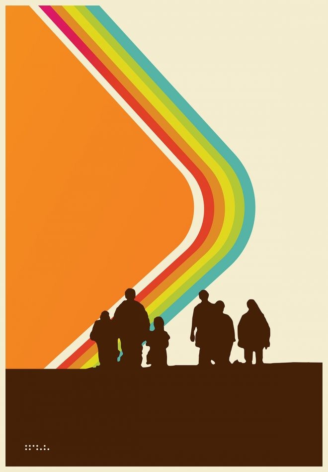
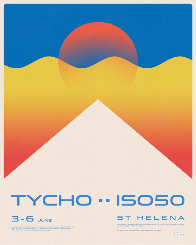
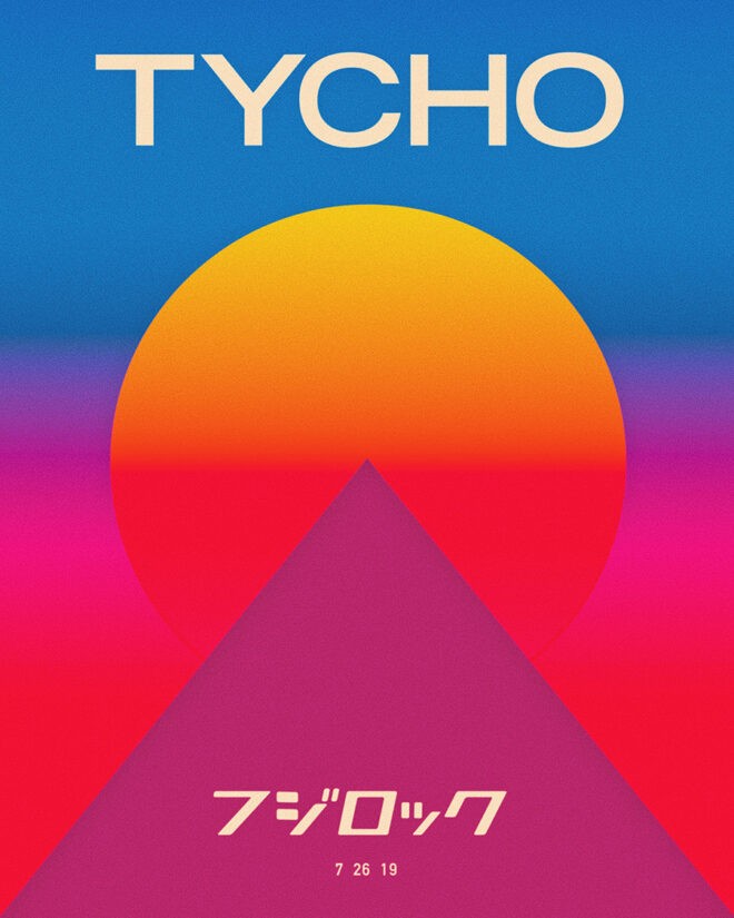
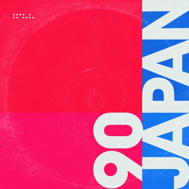
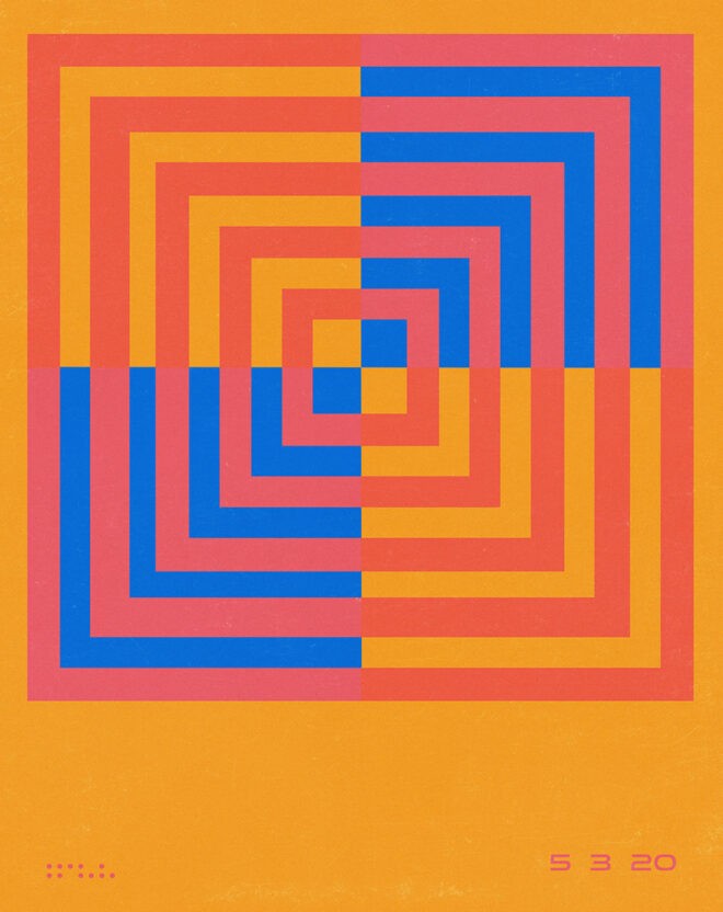
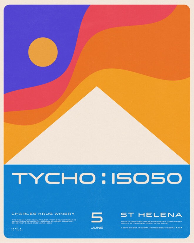
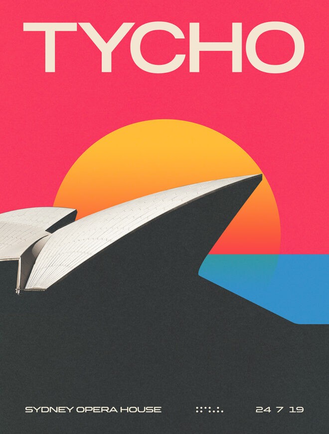
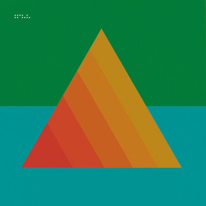
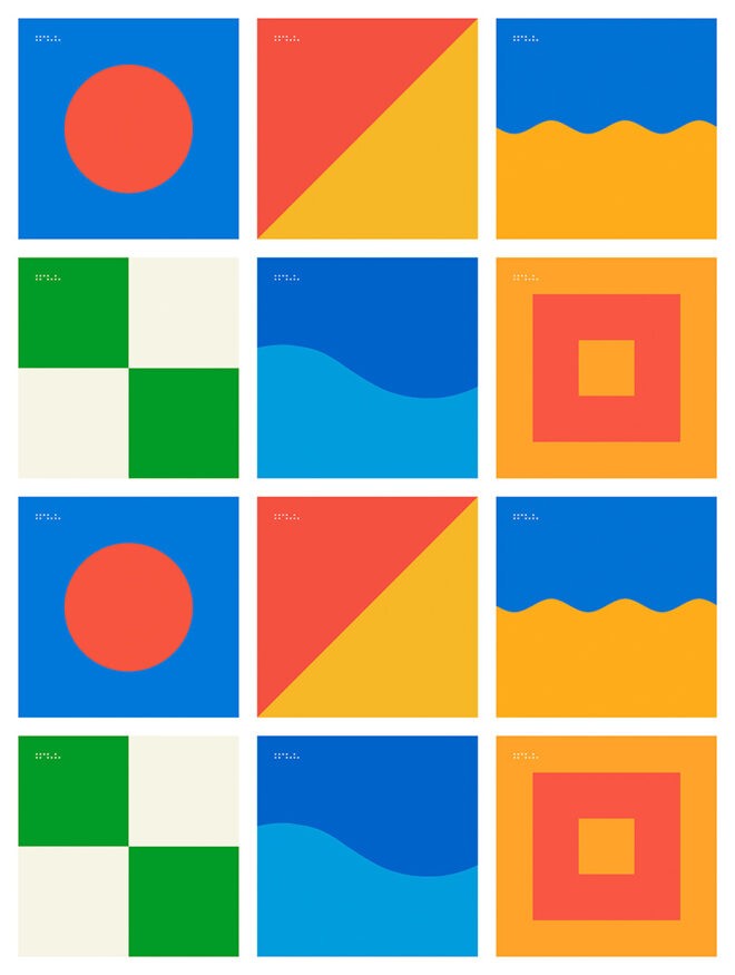
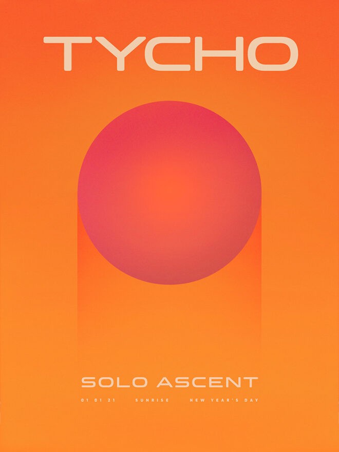
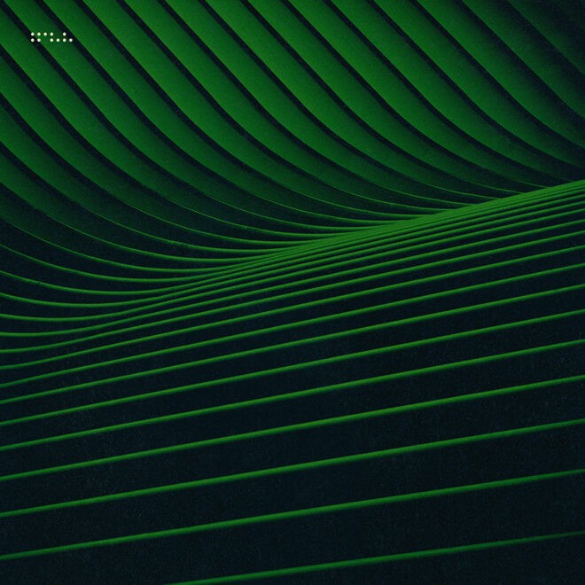
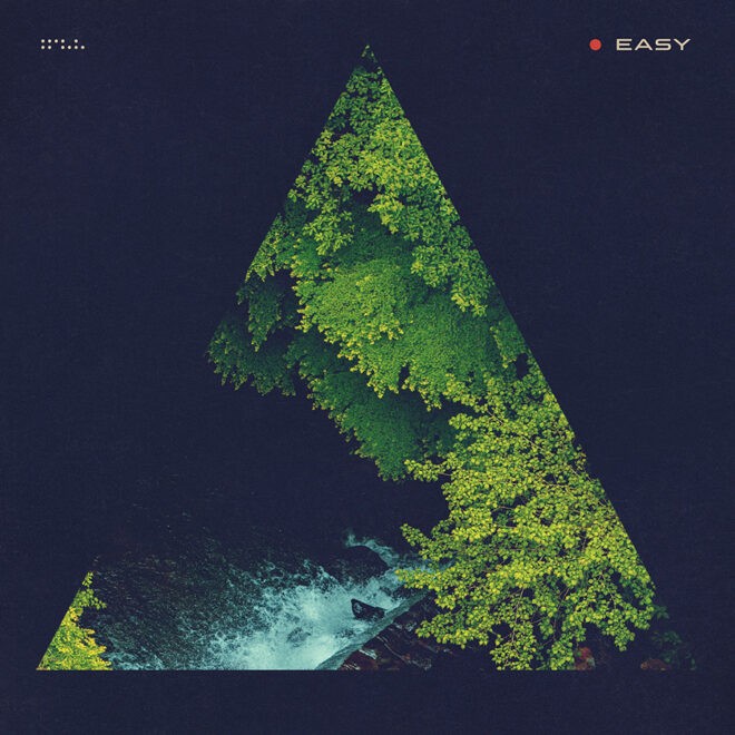
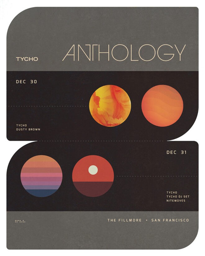
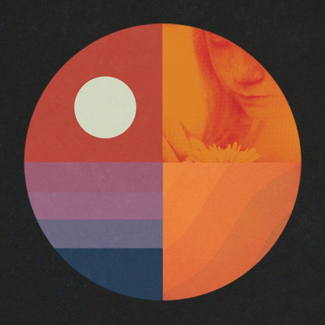
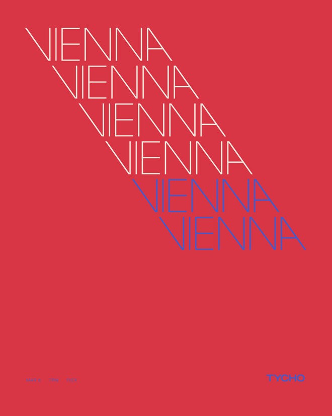
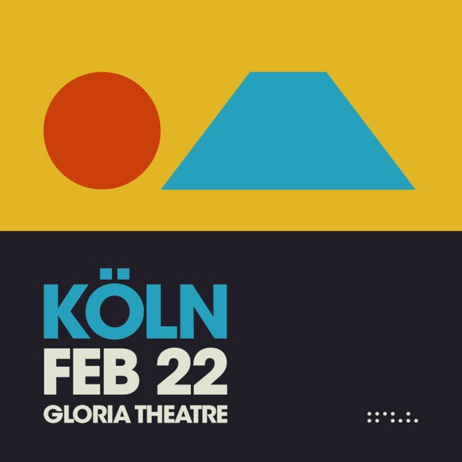
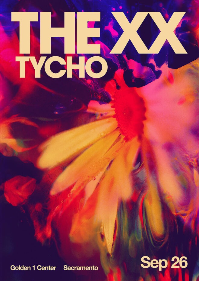
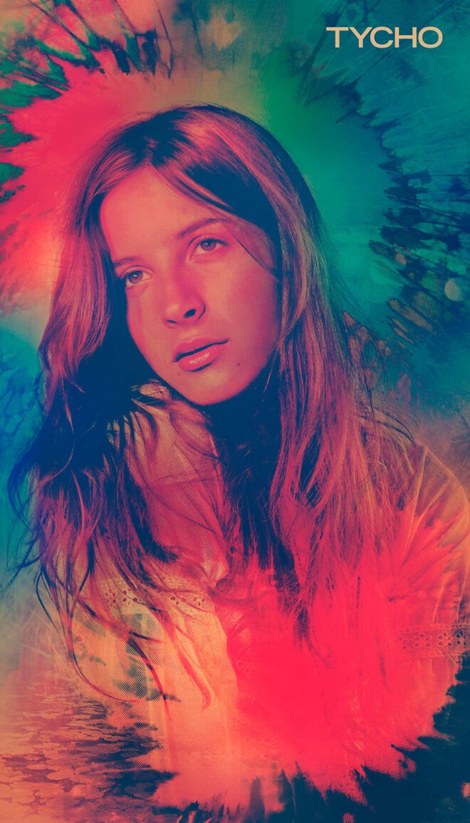
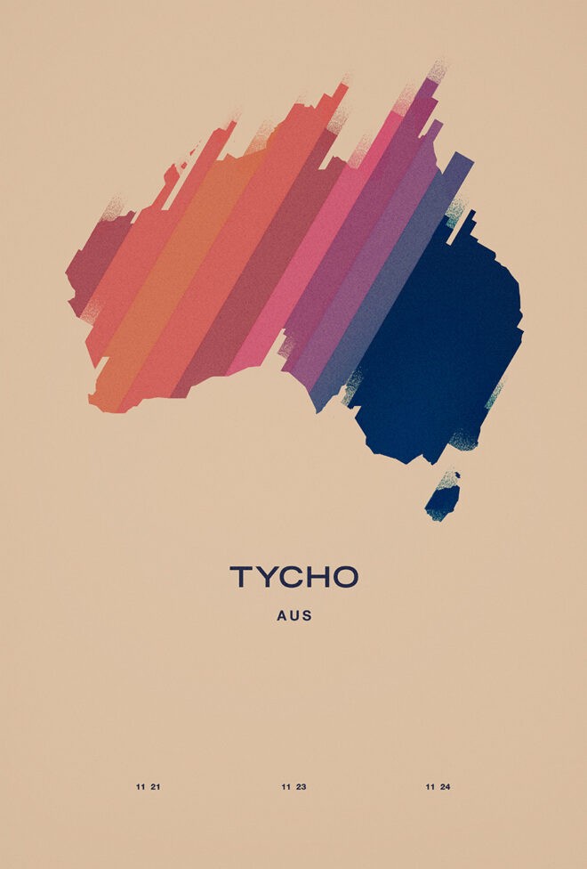
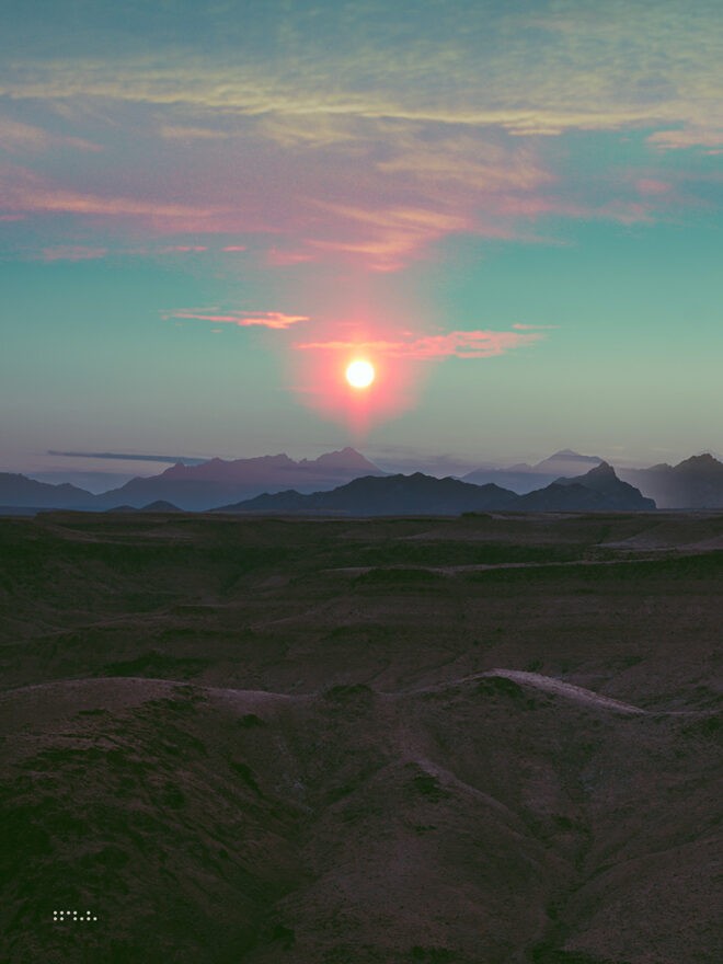
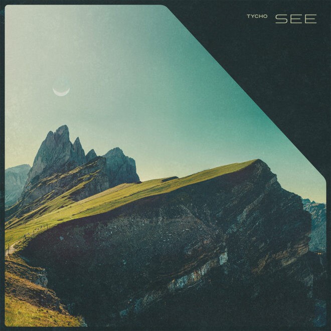
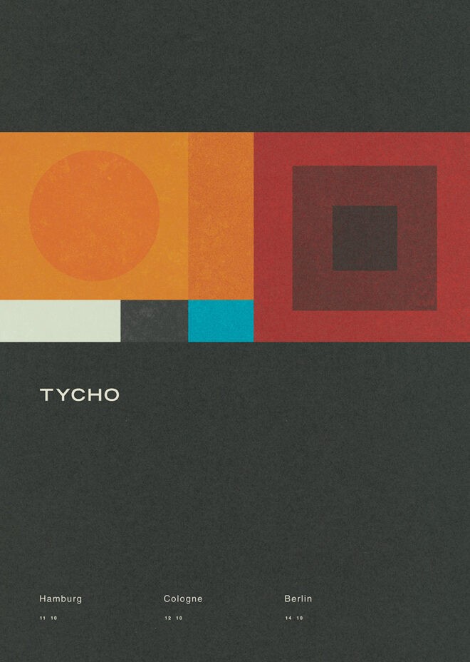
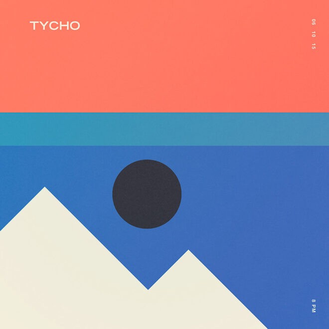
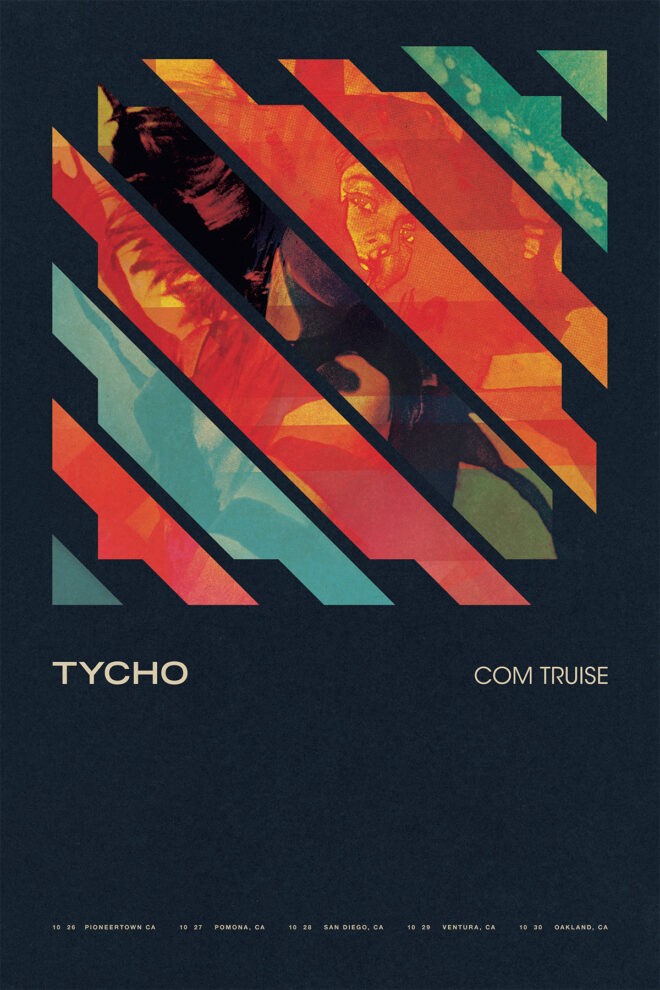
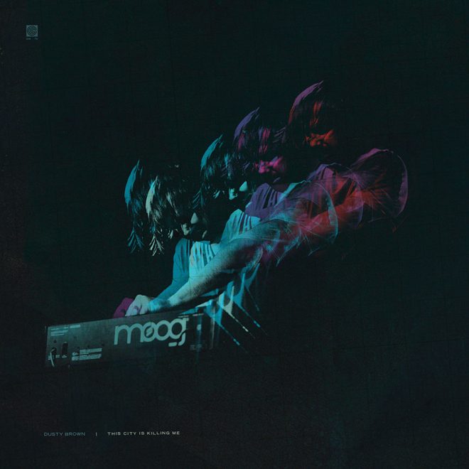
Collection 5: Weather (2018-Present)
Exploring a warmer, more vibrant palette and a focus on the now well established core iconography of Tycho. This was a time of constant change and movement that lead to a renewed passion for art and music.
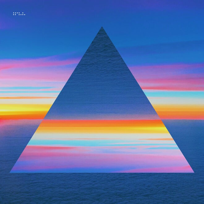
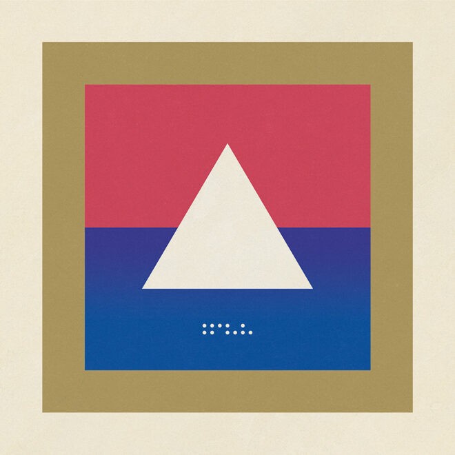

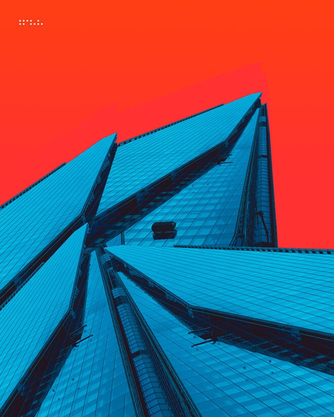
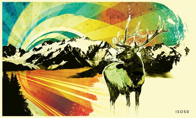
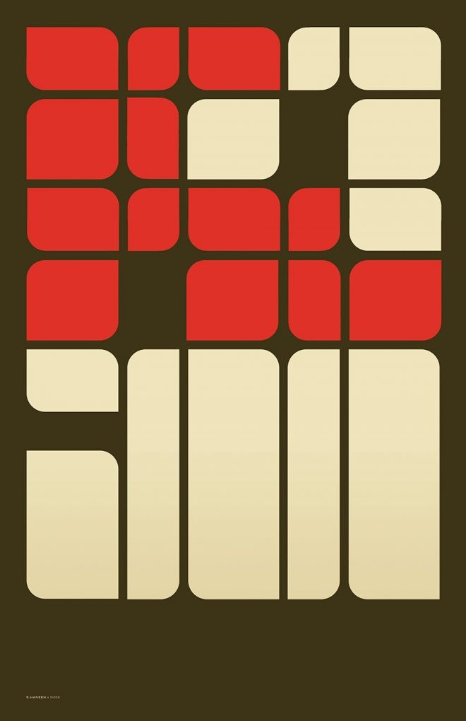
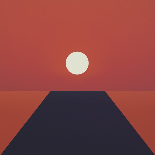
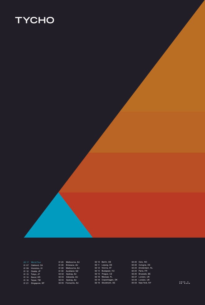
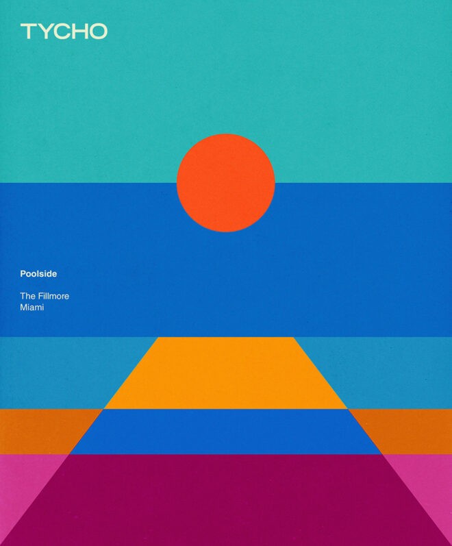
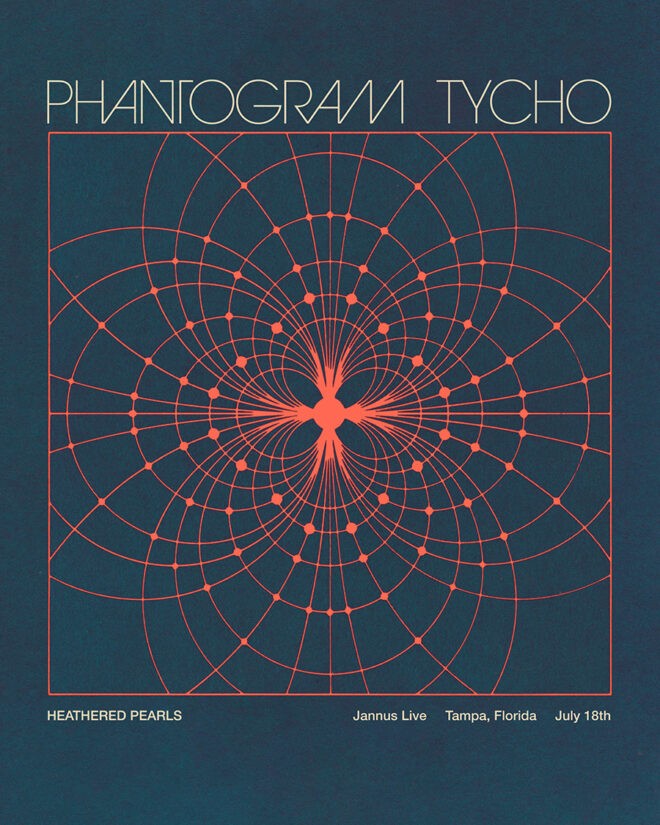
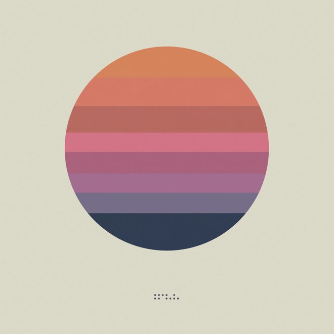
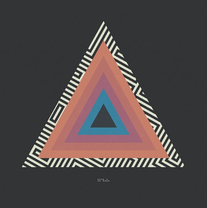
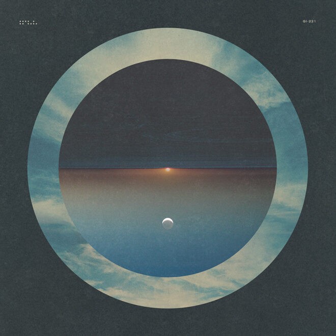
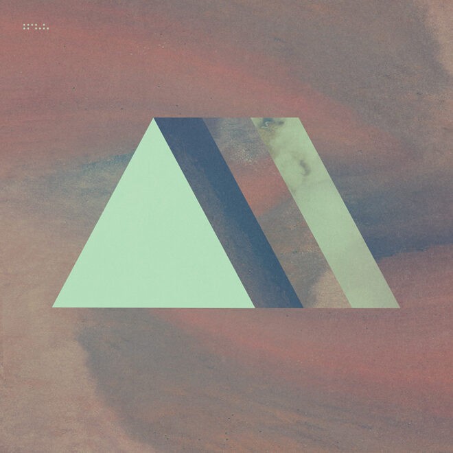
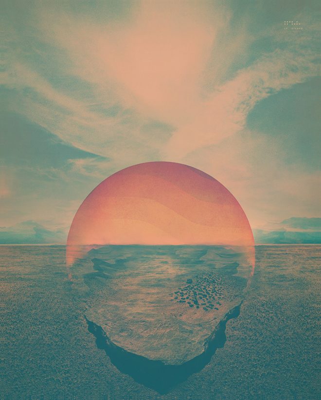
Collection 4: Epoch (2016-2018)
With a focus on color theory and simplicity of form this period saw a turn toward more vibrance and contrast while distilling compositions to their most basic elements.
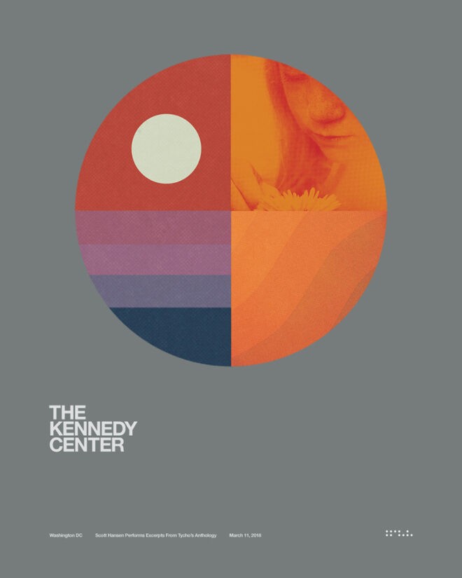
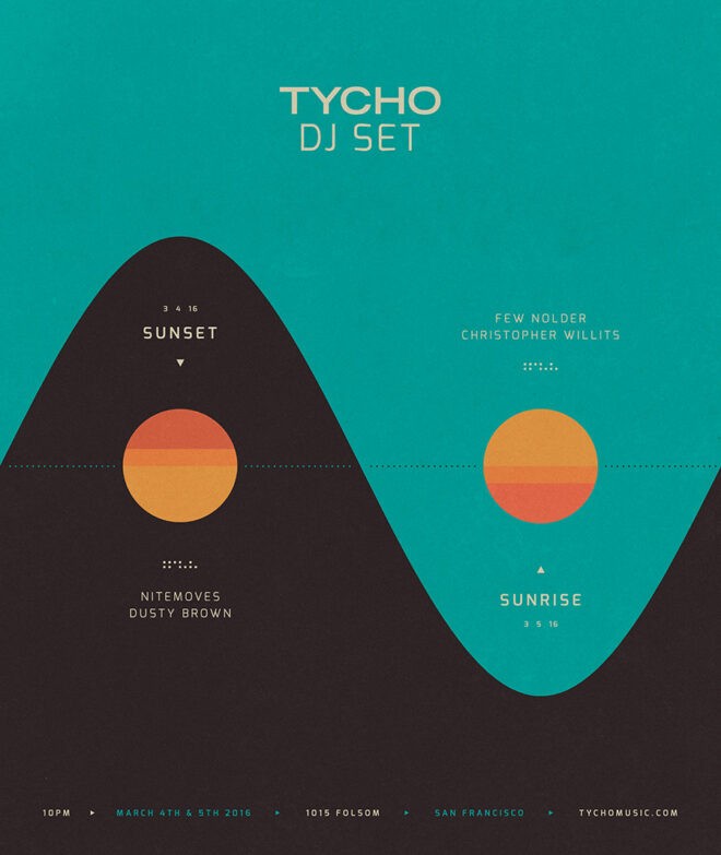
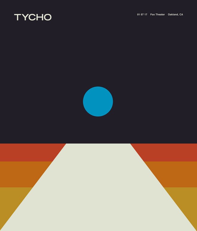
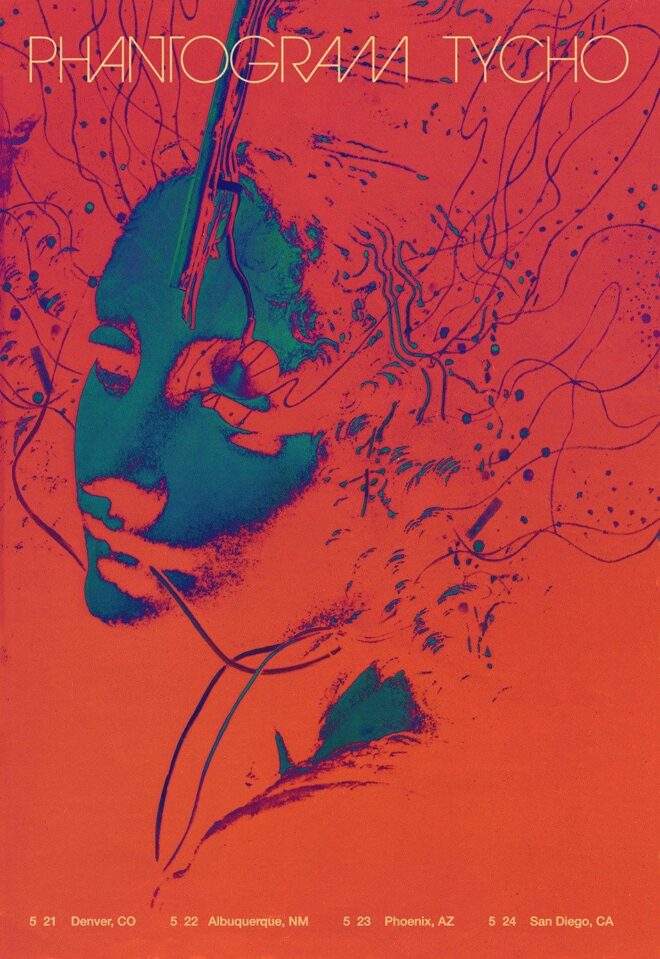
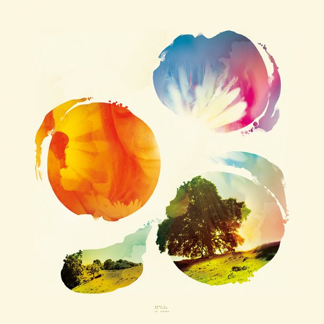
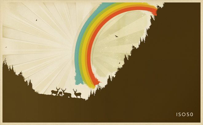
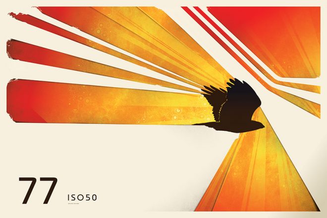
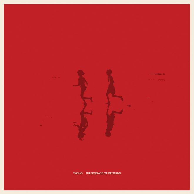
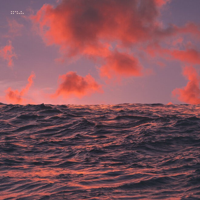
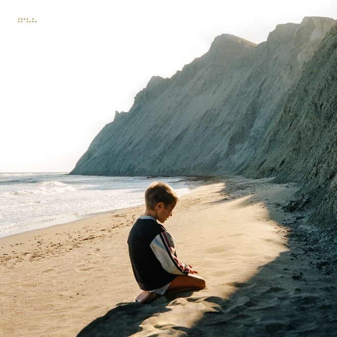
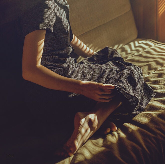
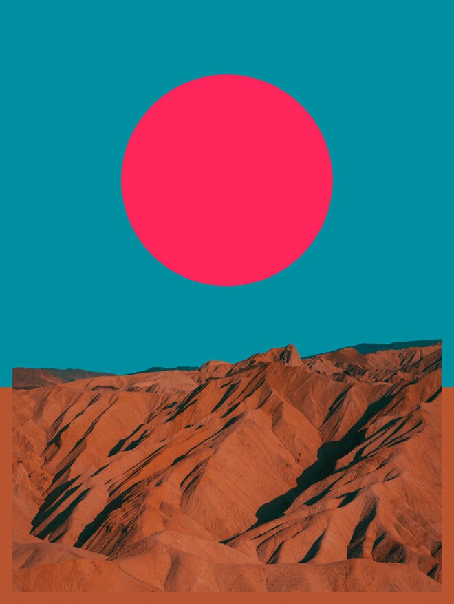
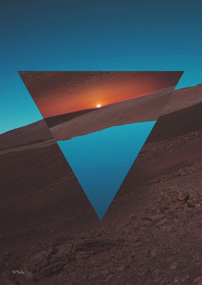
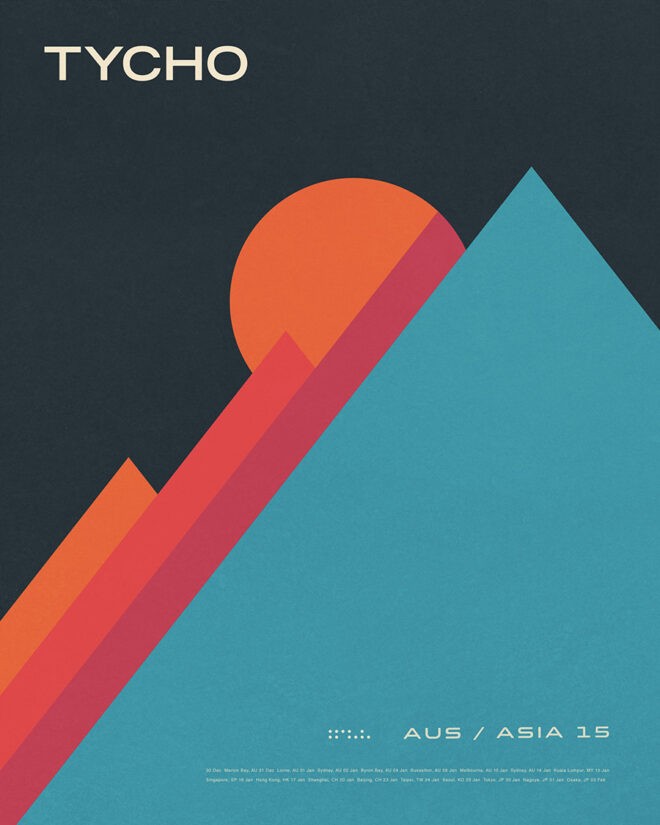
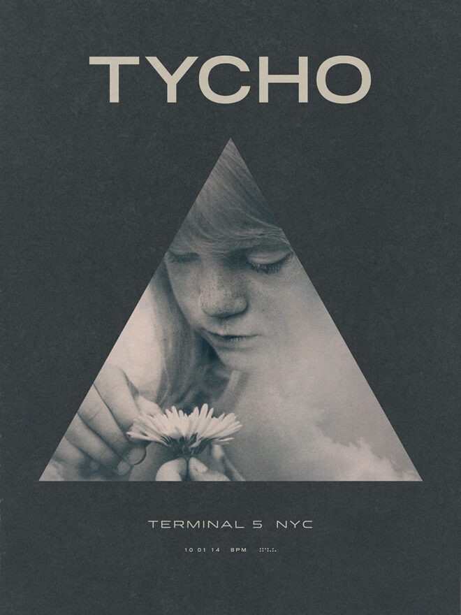
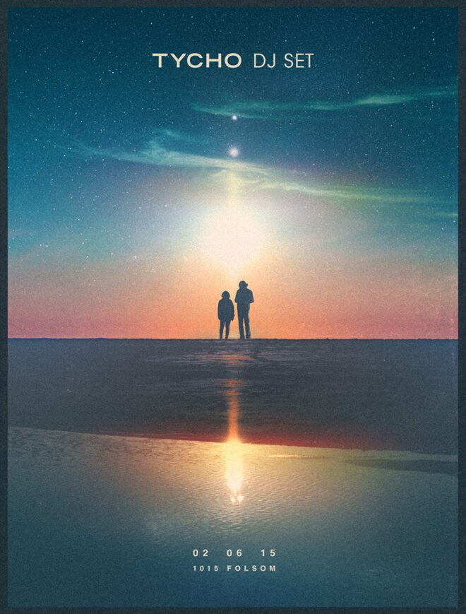
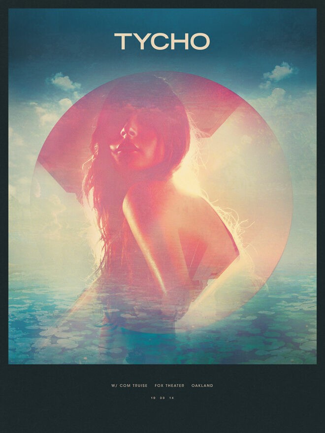
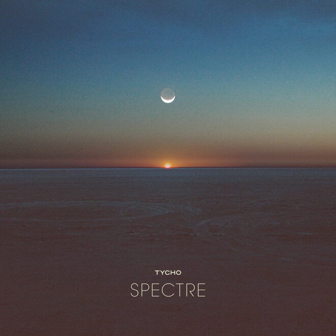
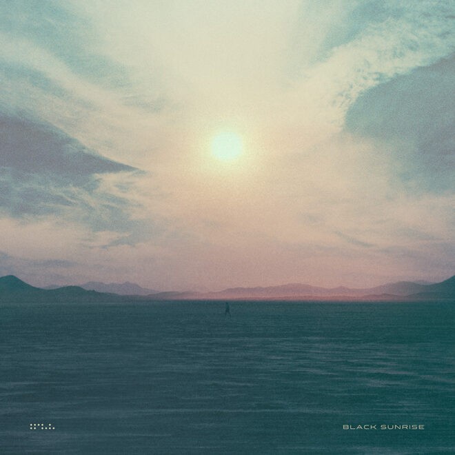
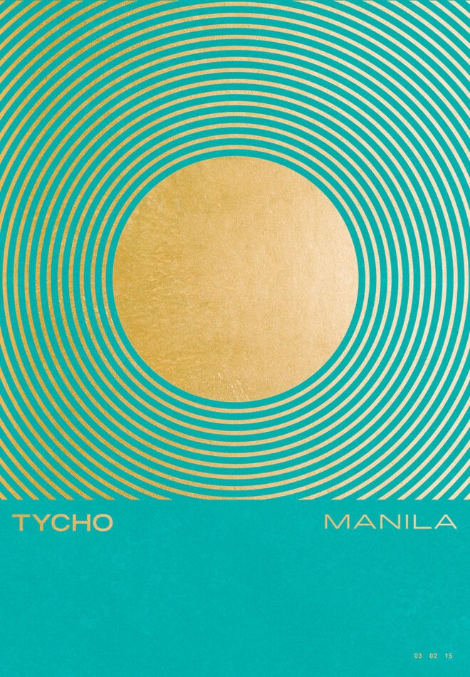
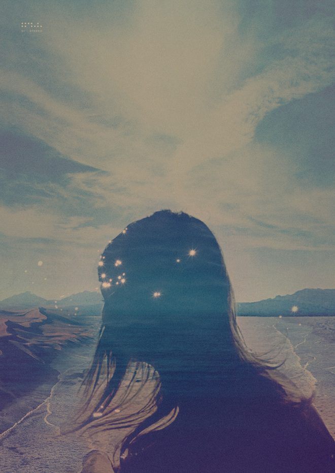
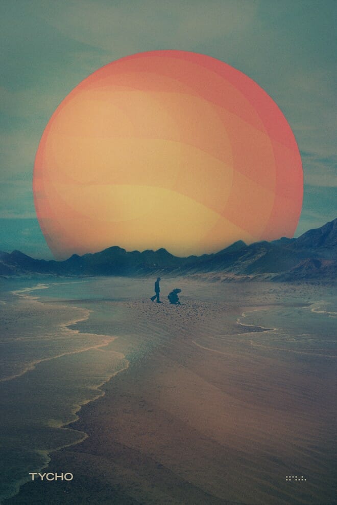
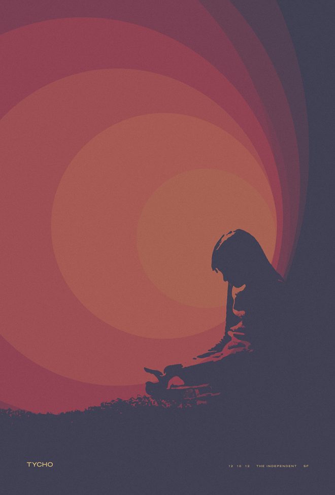
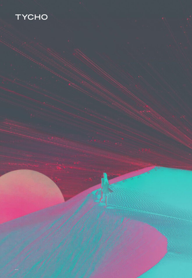
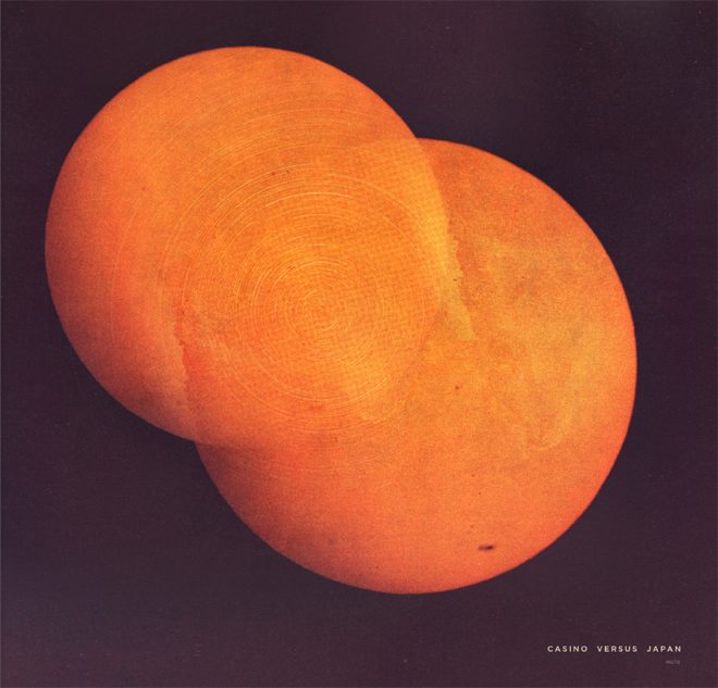
Collection 3: Awake (2013-2015)
Into the Awake years. A turn toward minimalism and a deeper dive into photographic compositions. Muted palettes and stark landscapes, I was searching for new themes in new environments. This period saw a complete focus on music and the art surrounding. Constant touring and the immediacy of working in unfamiliar spaces inspired a lot of the themes and imagery of this period.
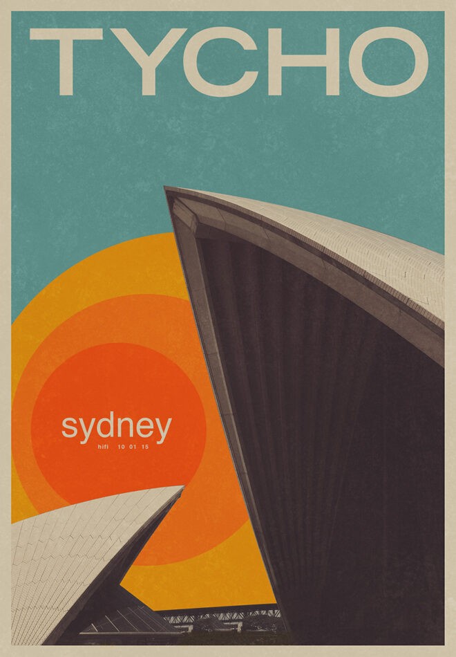
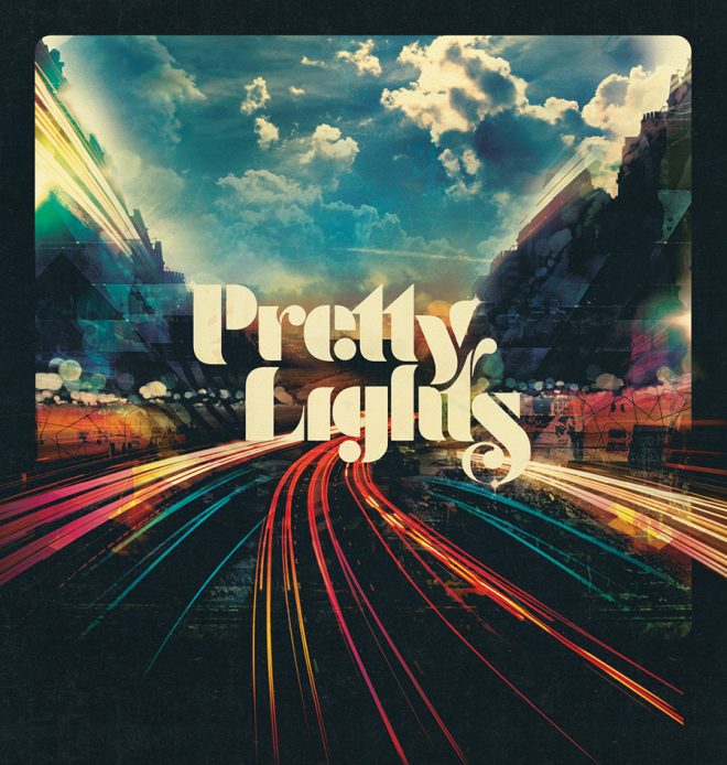
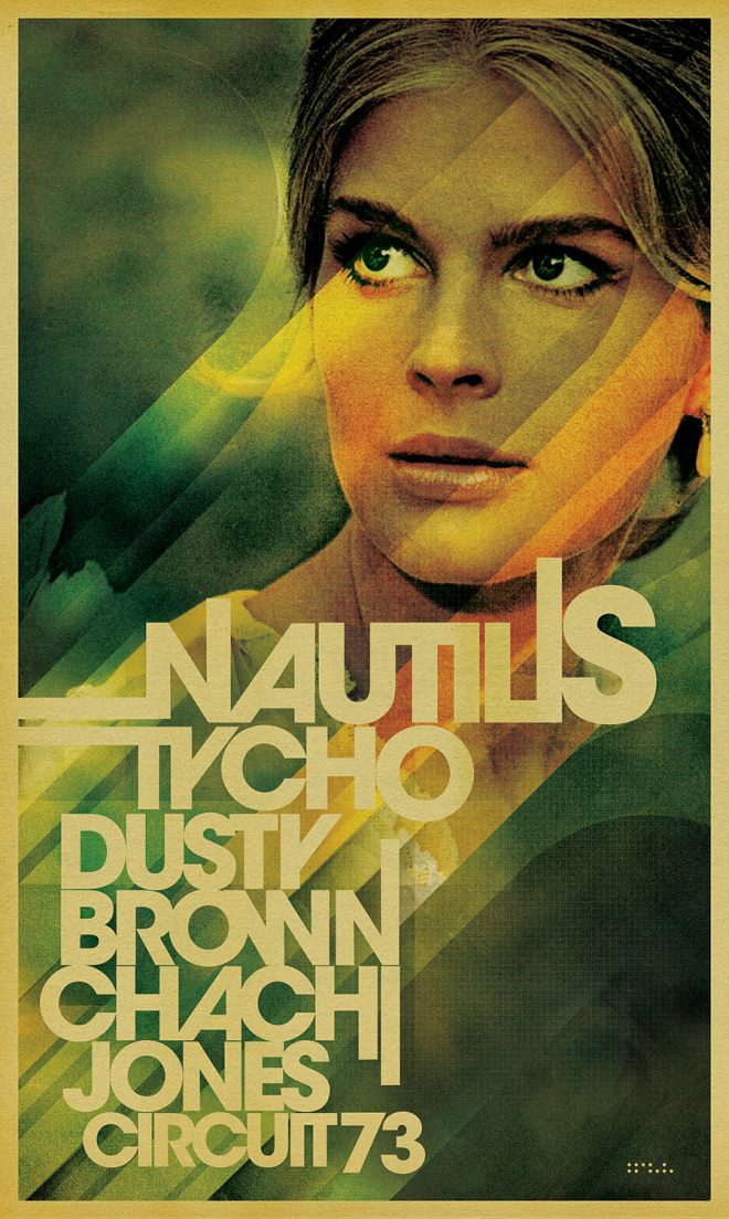
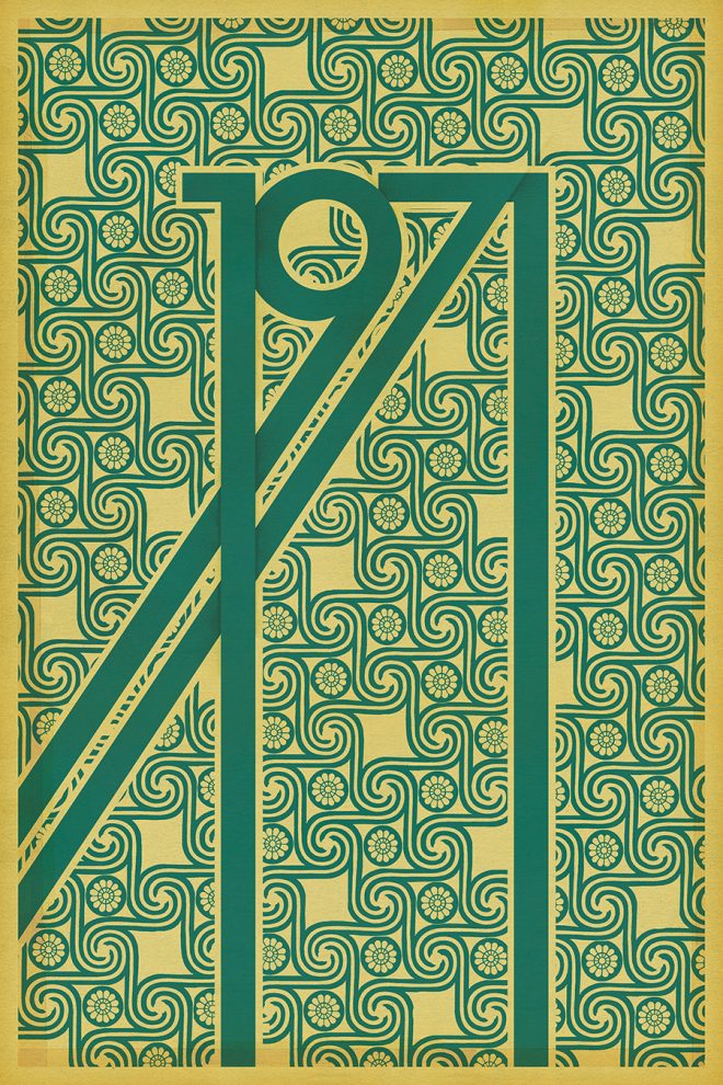
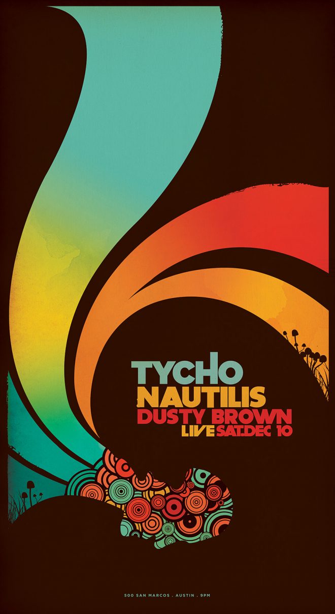
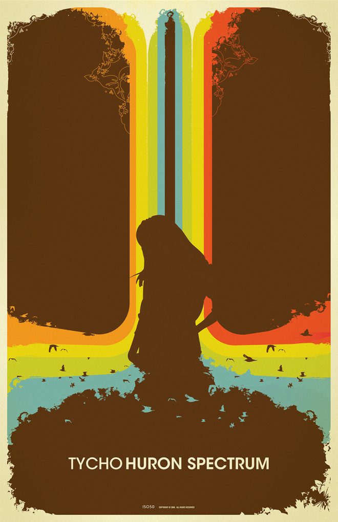
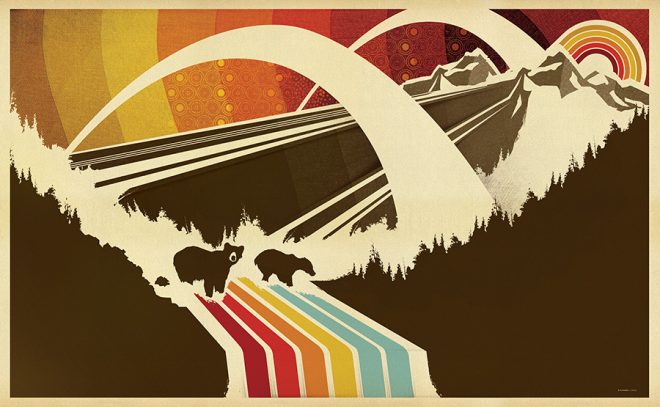
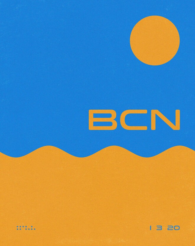
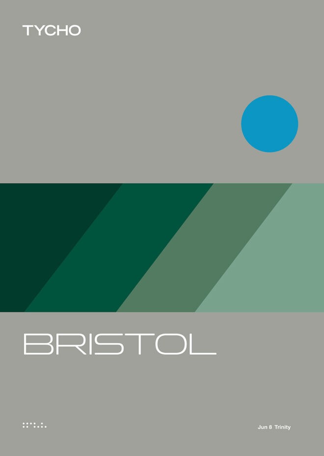
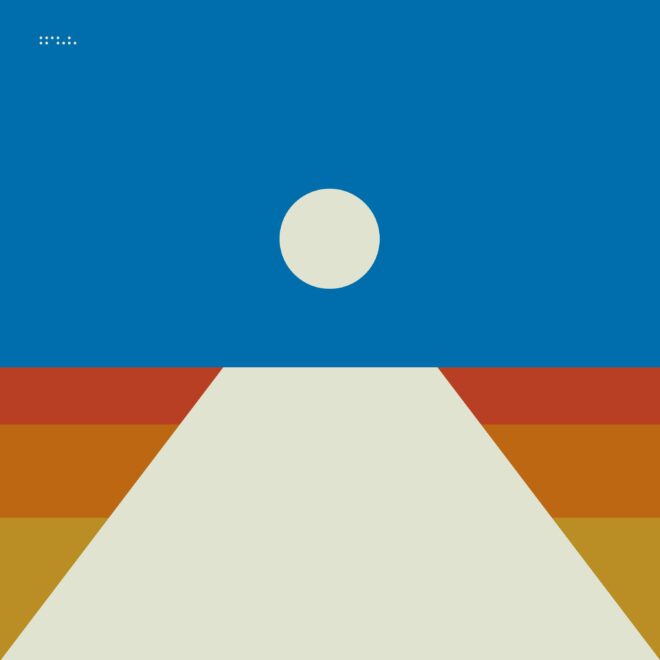
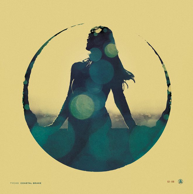
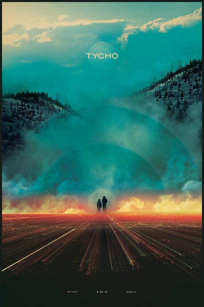
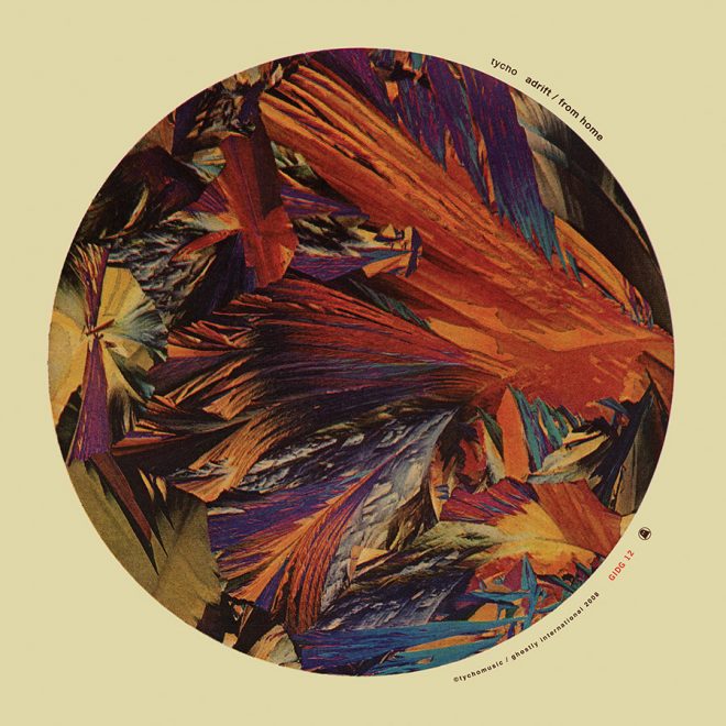
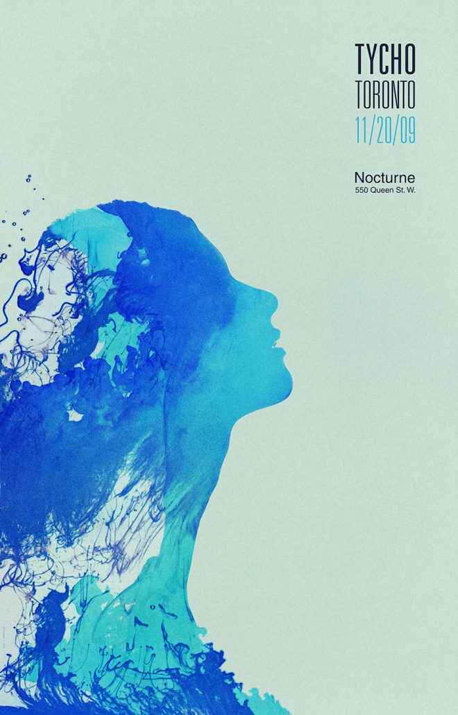
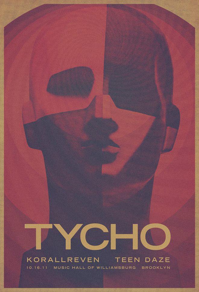
Collection 2: Dive (2007-2012)
In flux. A move from Sacramento to San Francisco and the transition from graphic designer to musician. The resulting work features a cooler palette and overall refinement of the style that foreshadows the minimalism to come.
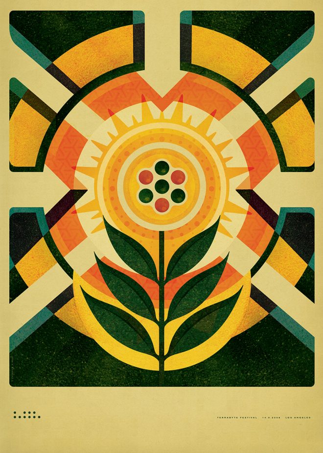
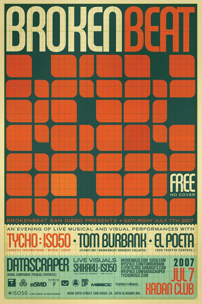
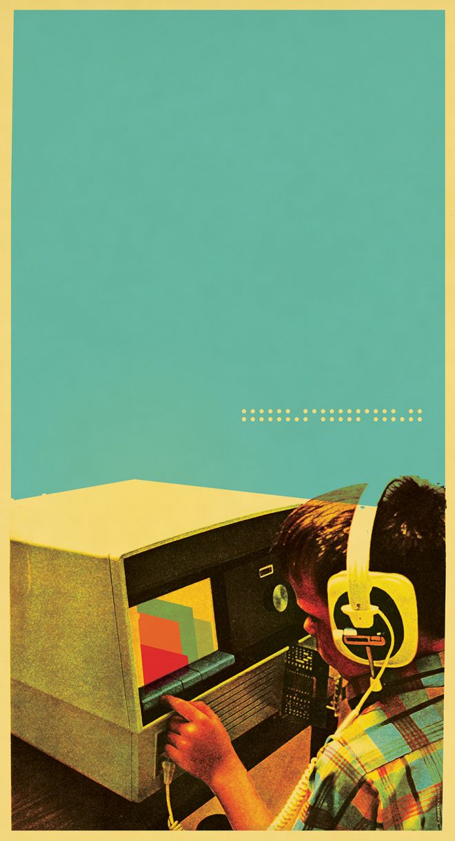
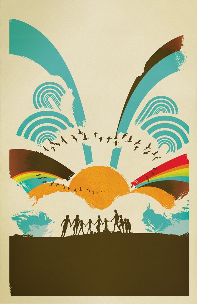
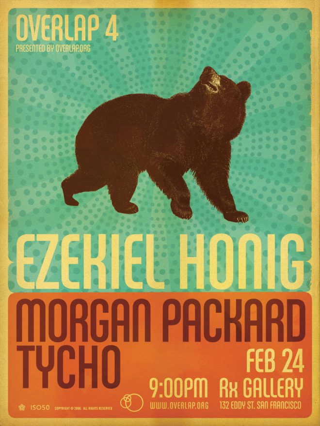
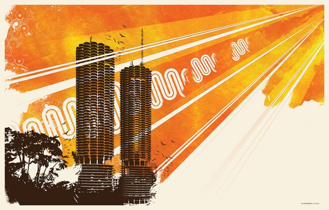
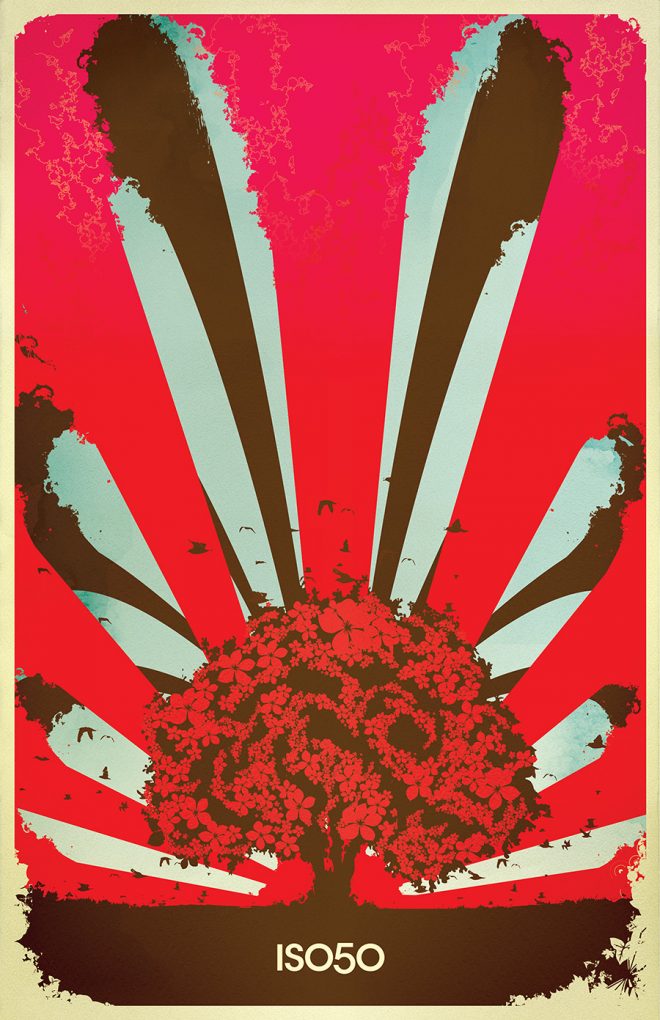
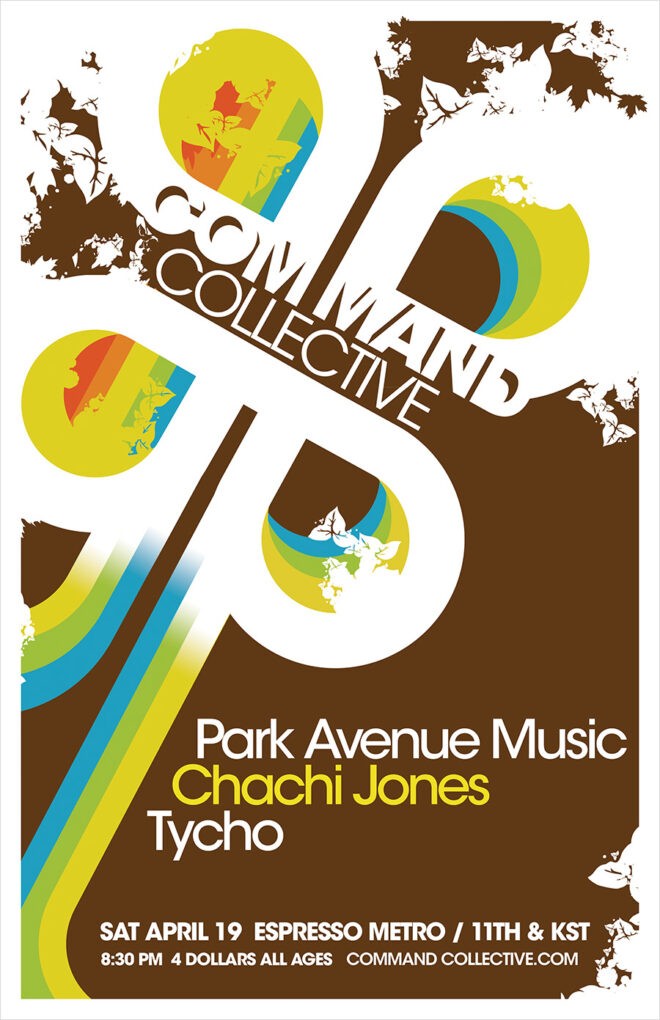
Collection 1: Past is Prologue (2001-2006)
Work from the formative early years and the birth of ISO50 and Tycho. During this period I was learning the tools and developing a visual language centered around the music and making an evolution from simple vector images to densely layered collages which mirrored the evolution of the Tycho sound.